Build trust
Use stronger credibility signals, relevant imagery and a clearer explanation of INITS’ expertise.
Website redesign · Biotech · 2024
Reframing a complex biotech offer as a clear, credible and inviting digital experience.
Audit → Research → Structure → Prototype → Test
My role
Freelance UX Designer
End-to-end owner
Duration
3 months
March—May 2024
Scope
Research · IA · UX/UI
Prototype · Testing
Collaboration
Founder
Internal team
01
The brief
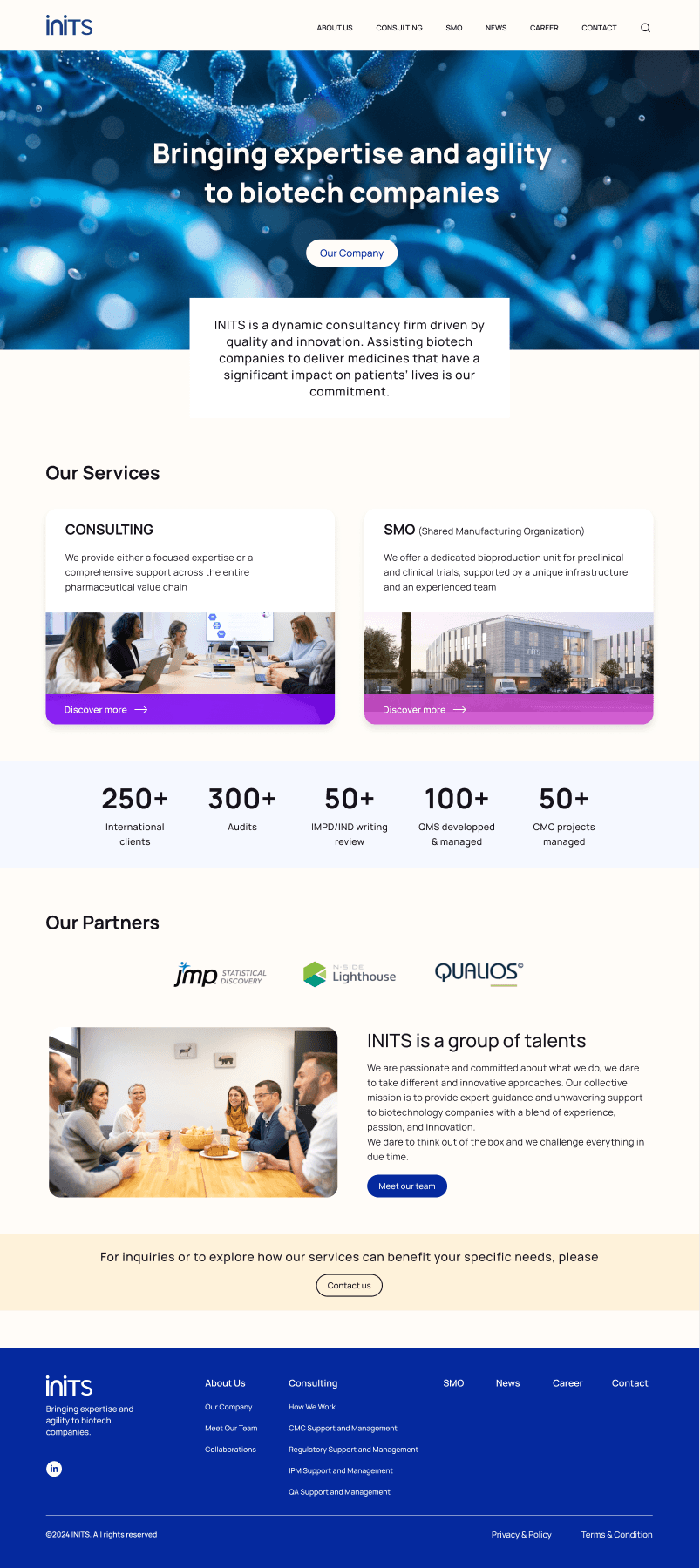
INITS needed its website to communicate a specialized biotech offer with more clarity and confidence. The work started with the inherited experience and continued through research, information architecture, interaction and final interface design.
Dense information, fragmented expertise and a visual experience that did not reflect the company’s credibility.
A coherent journey that makes the offer easier to understand while presenting one confident INITS brand.
02
Discovery
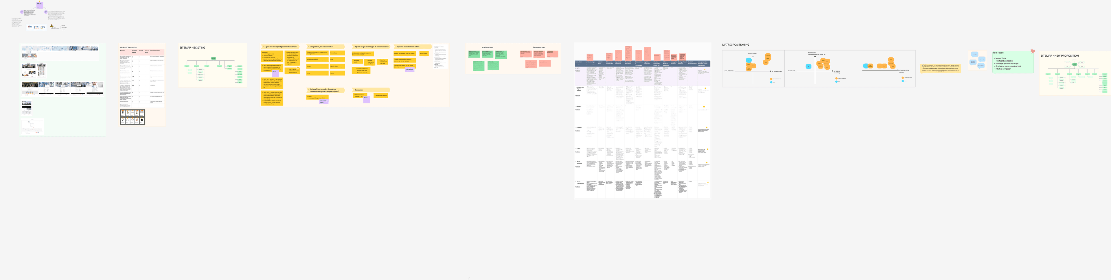
The discovery phase combined an existing-site audit, heuristic analysis, competitor benchmarking and positioning work. I mapped the current and proposed sitemaps, then translated the findings into concrete principles for the redesign.
Use stronger credibility signals, relevant imagery and a clearer explanation of INITS’ expertise.
Present several specialist services as one coherent brand without flattening their differences.
Make navigation and page structure intuitive for visitors unfamiliar with the technical language.
03
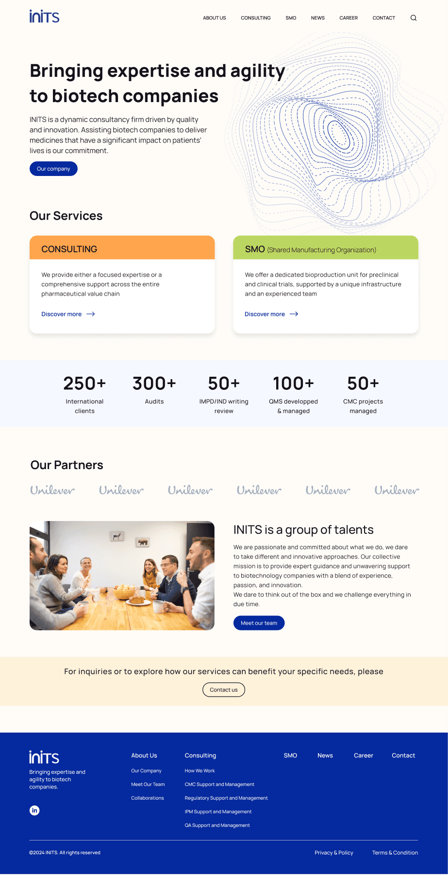
Before & after
Successive high-fidelity iterations made the change tangible. The final direction simplified the hierarchy, strengthened the deep-blue INITS identity and used violet and magenta accents to distinguish services without fragmenting the experience.
04
Design system
The visual system uses an off-white canvas, near-black typography and deep INITS blue as its foundation. Violet and magenta lead the final experience, while distinct supporting colors help identify specialist service areas.
Visual principles
05
Final screens
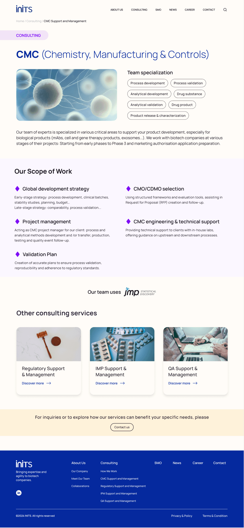
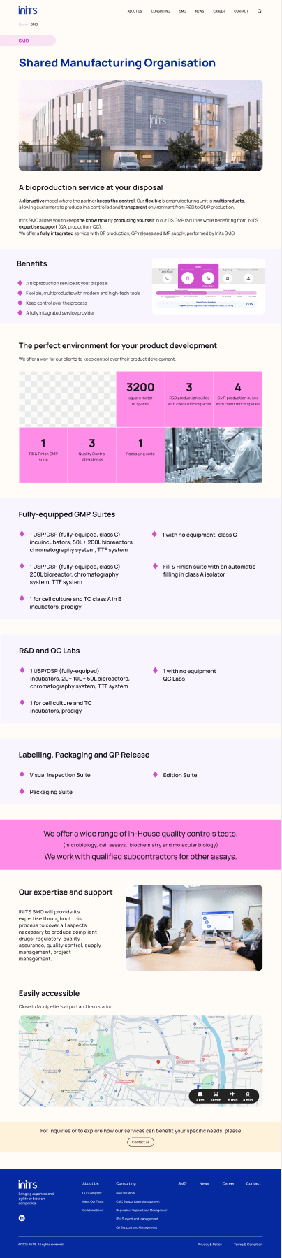
The final pages apply the same navigation, hierarchy, cards and calls to action across very different content. CMC stays information-rich without becoming overwhelming, while the longer SMO page combines facilities, benefits and operational detail in one readable journey.
Outcome
The redesign aligned business objectives and user expectations in one coherent experience, giving the team a clear blueprint for implementation and future evolution.