Helia — designing AI support at enterprise scale
Over two years, I helped turn an AI proof of concept into a bilingual support service inside a digital workplace portal serving more than 100,000 employees worldwide.
Product Designer · two-person design team · Sept 2024 – Aug 2026 · a leading French banking group · global, English & French
Read the story ↓
What it changed
Outcomes the design work contributed to, over two years in production.
−25%
support tickets
78%
Helia satisfaction (CSAT)
−15 pts
portal findability friction, 85% → 70%
01In short
Two years of research and design turned an approved proof of concept into Helia — a bilingual assistant woven through the portal, with tickets down 25% and satisfaction at 78%.
The problem
Employees inside a portal serving 100,000+ people struggled to solve common digital-workplace problems on their own. Avoidable support contacts and ticketing costs kept rising, and an approved AI proof of concept had to become a real service.
My contribution
I worked in a two-person design team alongside a Lead Product Designer. Rather than separating the work into fixed lanes, we jointly framed studies, challenged decisions, designed and tested solutions, and followed them through delivery.
What changed
Helia grew from an isolated chat window into a named, bilingual assistant woven through the portal — with clear scope, feedback, recovery and a direct route to human help. Tickets fell 25% and satisfaction reached 78%.
02The strategic challenge
How might we help employees resolve common digital-workplace problems autonomously, while preserving trust and a clear path to human support?
The challenge was never just the chatbot. It was making automated support useful, trustworthy, discoverable, accessible, technically feasible — and safely connected to human help. That meant working at several levels at once, from the wording of a loading message to the architecture of the portal around it.
- 1The conversational experience
- 2The end-to-end support journey
- 3Helia's integration into the wider portal
- 4The team's continuous discovery and delivery
- 5Balancing user value, business cost and feasibility
03From proof of concept to production
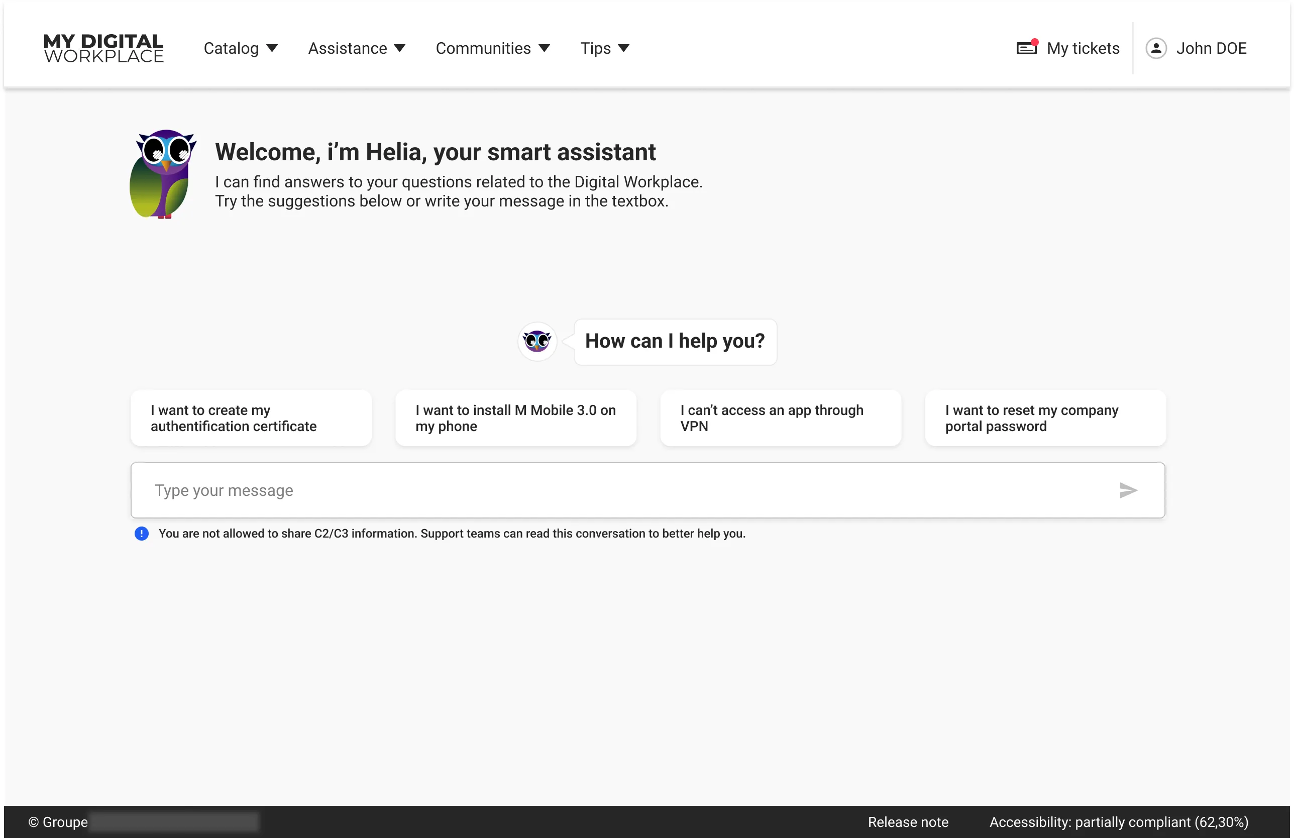
When I joined, Helia was a nameless demo awaiting a go/no-go — no identity, no recovery path, no defined place in the support journey.
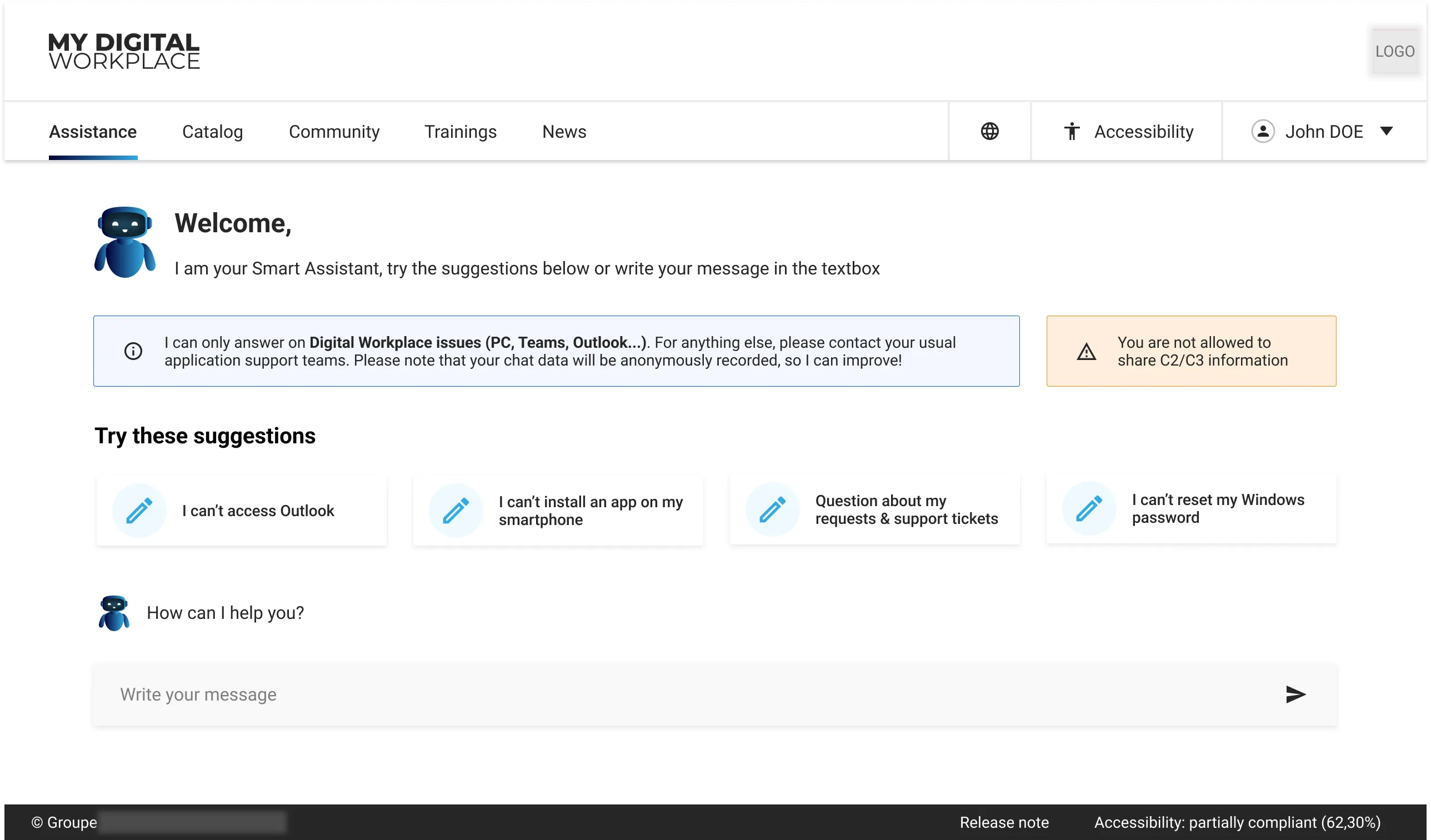
When I joined in September 2024, Helia was a proof of concept awaiting a go/no-go decision: a nameless "Smart Assistant" that could answer questions but had no identity, no recovery path and no defined place in the support journey.
After approval, the work shifted from proving the technology to making it viable: what should it answer, how should it fail, and where should it live? Early research drew a line between AI novices and expert users — and showed that trust, user control, an understandable scope and a human fallback mattered to both.
04What employees needed from AI
Testing was positive — but people wanted an assistant that felt human, spoke plainly, and answered step by step.
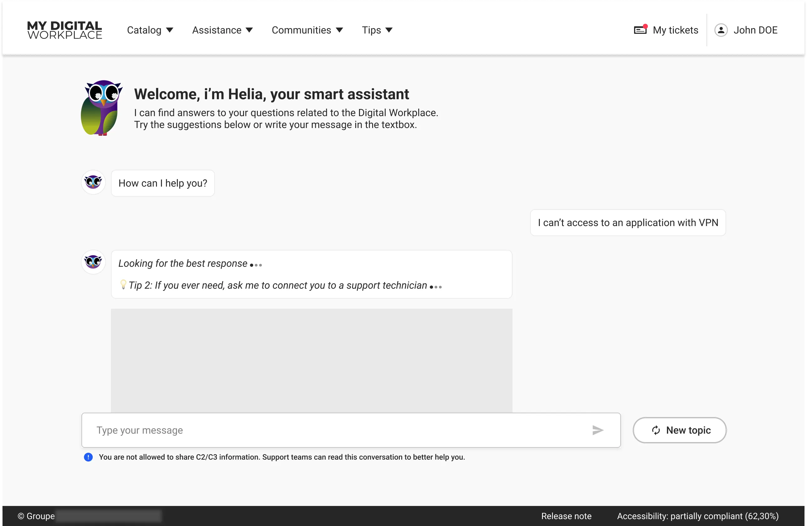
We evaluated the second version with eight remote moderated tests and six guerrilla sessions. The reception was positive — 22 of the 25 adjectives participants chose were favourable, with "simple", "easy" and "effective" recurring — but the gaps were consistent and specific.
People wanted the assistant to feel more human and memorable, so we gave it a name and an identity: Helia. The word "prompt" was poorly understood, so the interface speaks plainly instead. And because users skimmed past long blocks of text, answers became progressive, step-by-step procedures.
What we heard → what we changed
05Designing the full support journey
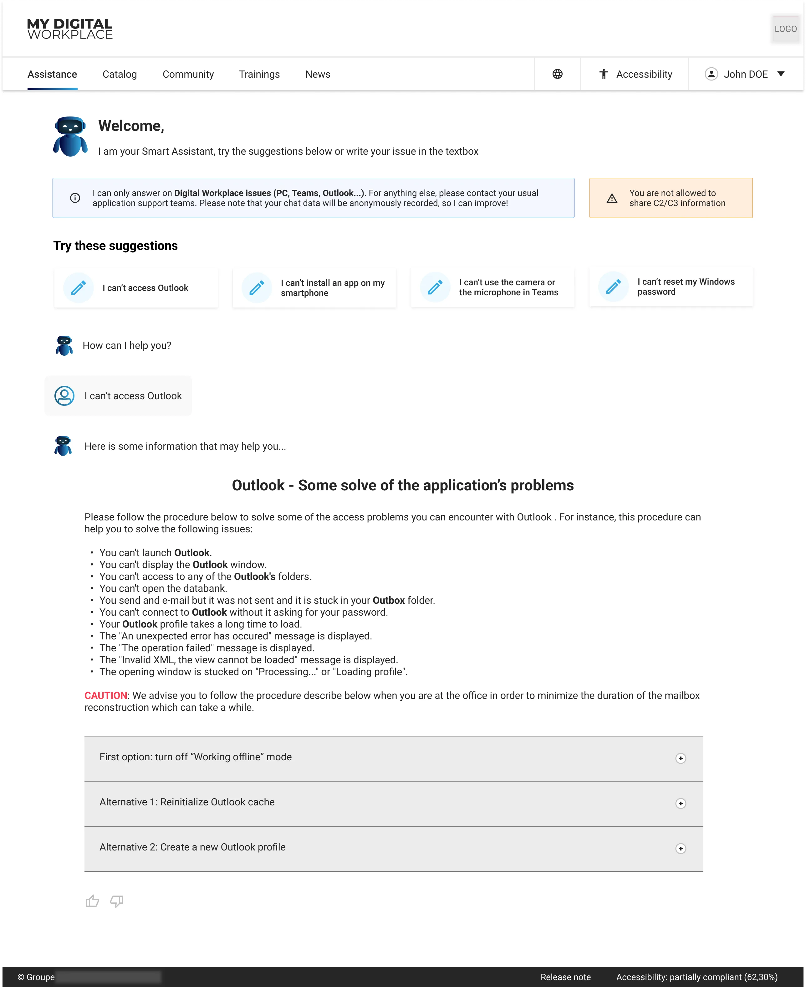
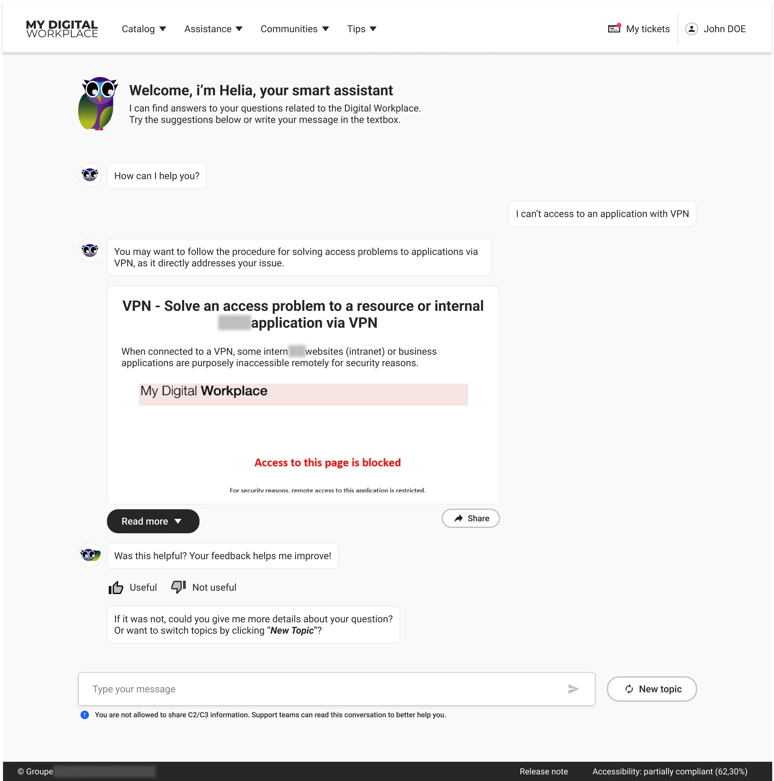
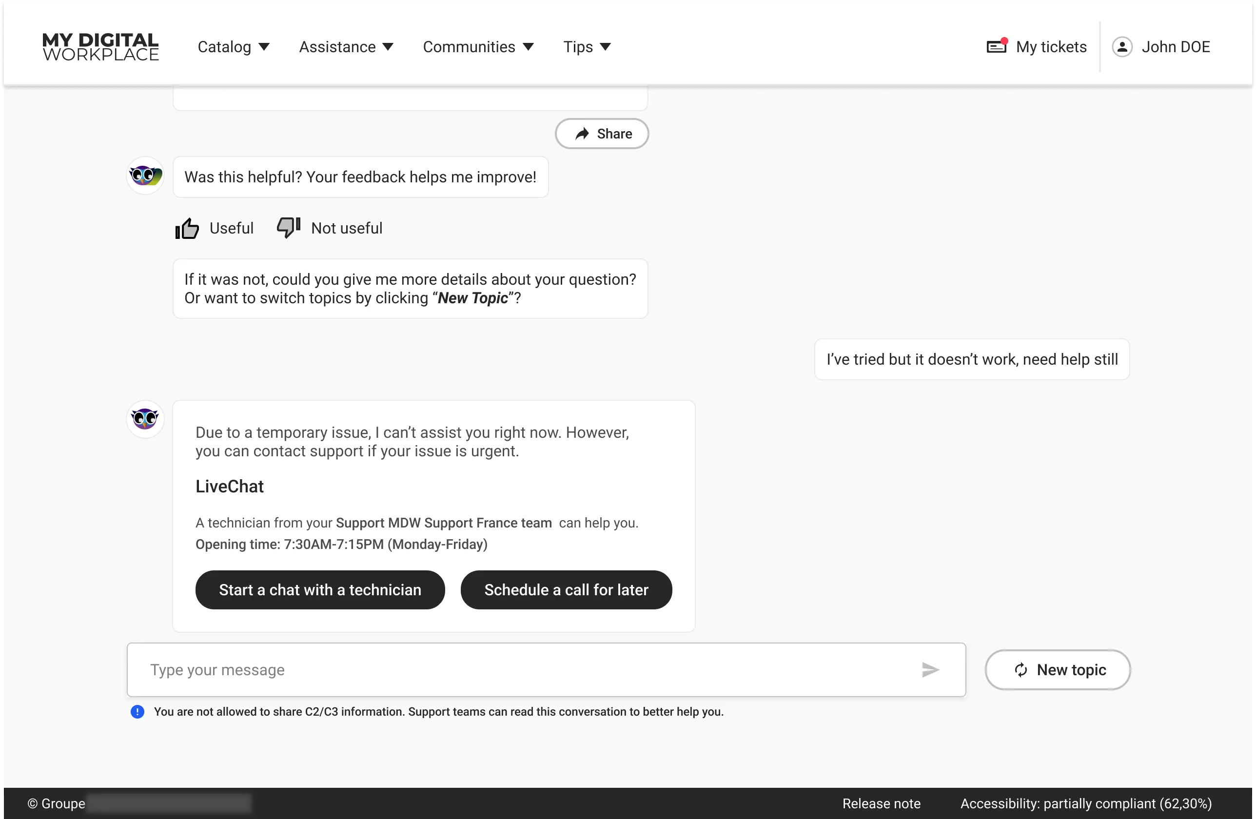
Every state in the journey exists because a failure mode showed up in research.
Technical AI teams owned the model's accuracy and speed. Our work was everything around it: the states that decide whether an automated answer feels like help or like a dead end.
06Making Helia discoverable
People who used Helia trusted it — but many employees never found it at all. Adoption was an ecosystem problem.
Eleven interviews revealed a visibility gap: employees who used Helia trusted it for simple problems, but many never found it. The work moved beyond the assistant to its place in the portal.
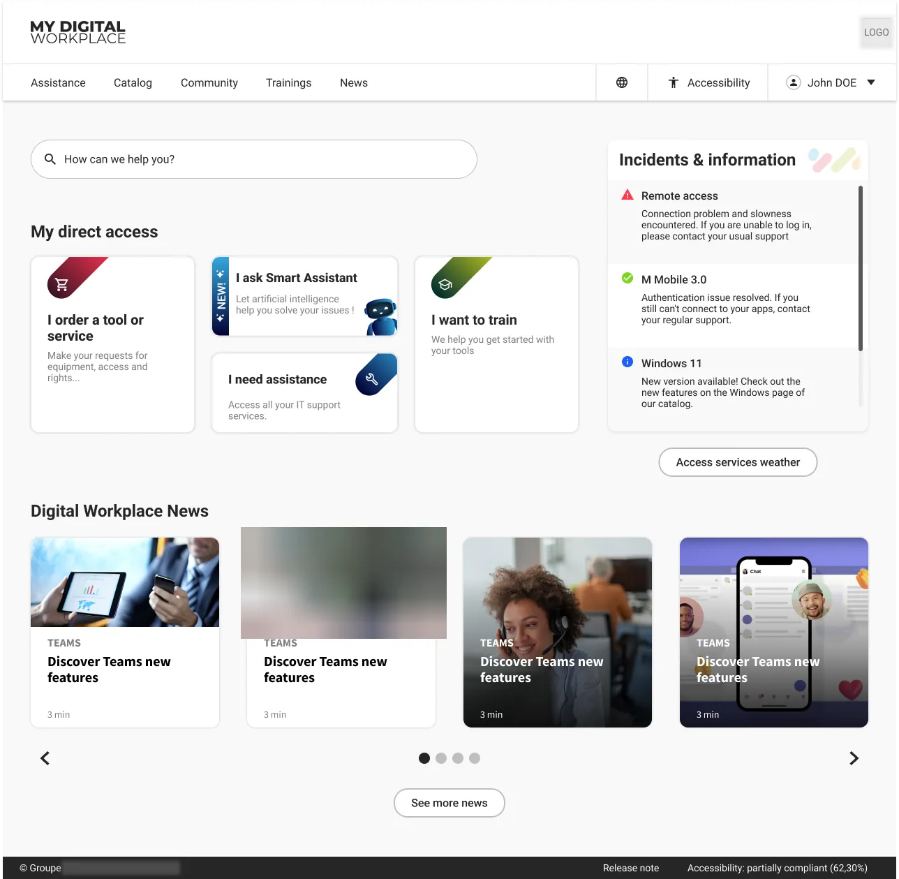
The Assistance page evolved in three steps: no assistant, a first Helia card, then a redesign around Helia, support articles, requests and tickets.
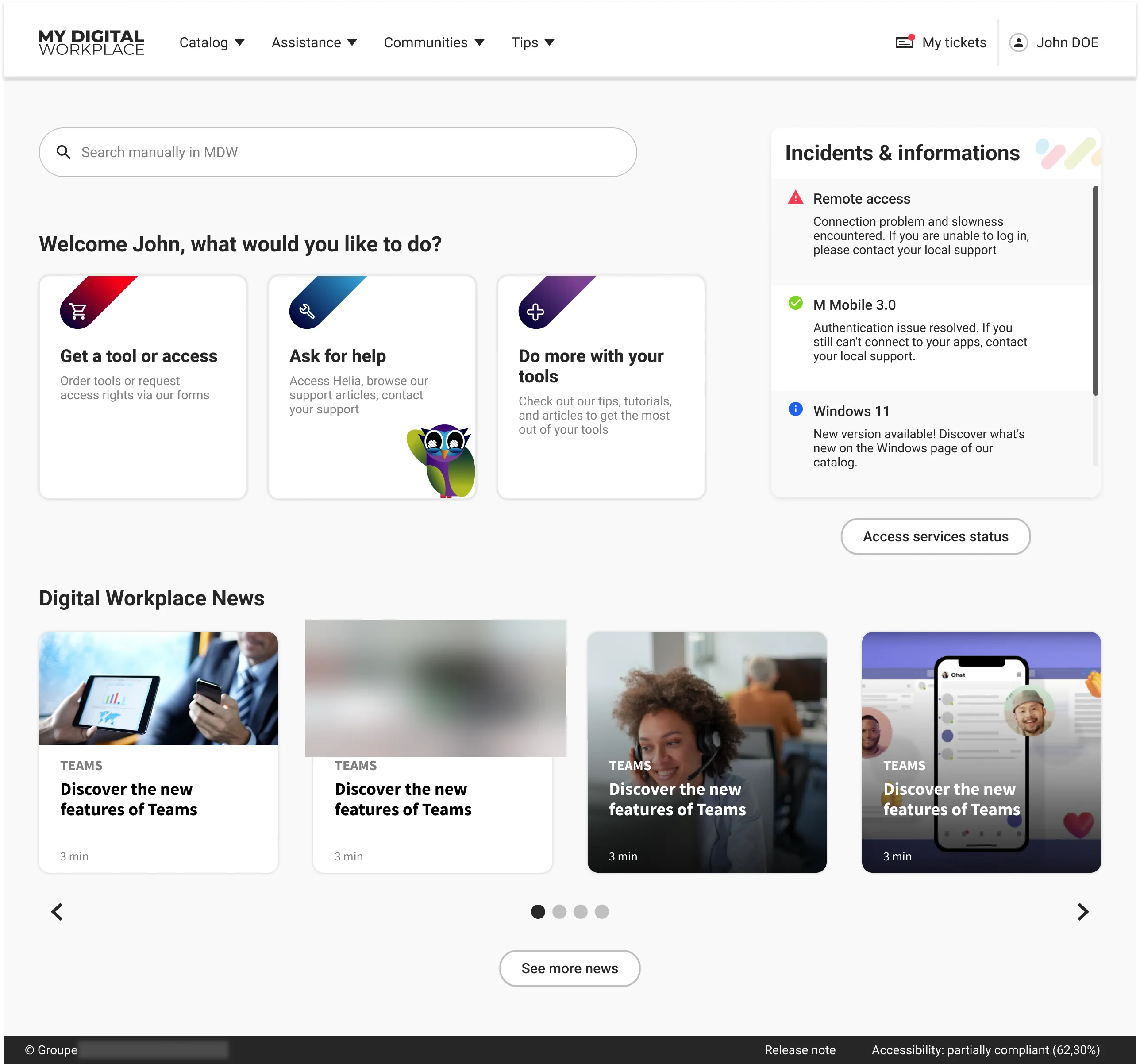
On the MDW homepage, we first placed Helia alongside the familiar Assistance button, giving users time to adjust. Both then became one “Ask for help” entry point, with Helia integrated. Thirteen users tested the request integration and visibility concepts before build.
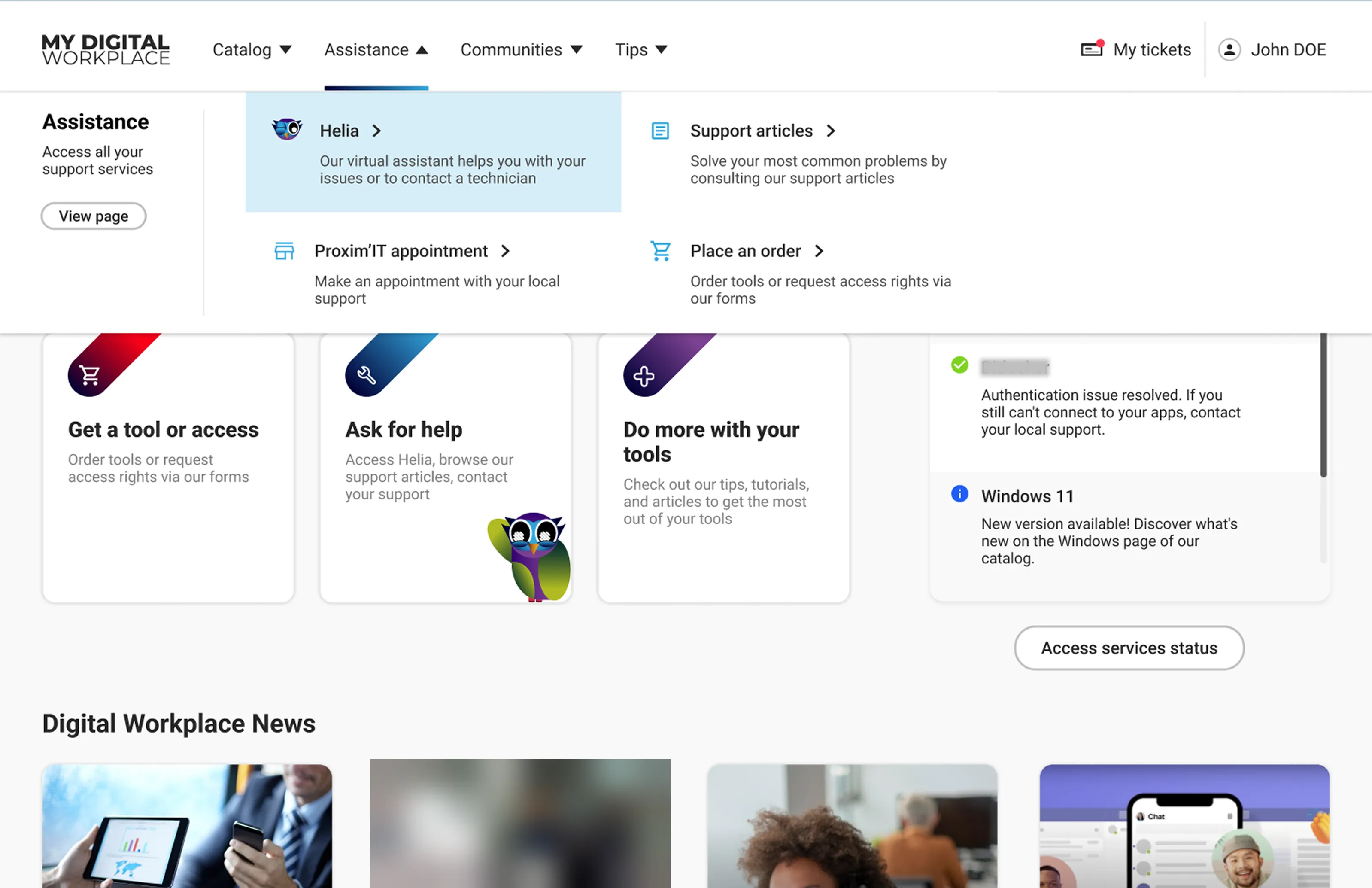
A new header, in brief
The portal's navigation needed to get better, so we ran a full UX study on the header and implemented the result. The new header gives direct access to sub-menus, and made the portal's scope clearer to users.
For this project, it was also an opportunity — and a business goal — to create a direct entry point for Helia, reachable from any page.
07Continuous discovery across two years
Each study changed what got built next.
The organisation ran Agile SAFe — Program Increments, sprints, PI planning — and research, design, delivery and measurement repeated inside each increment rather than happening once at the start.
V2 testing produced the identity and plain-language work, the satisfaction interviews triggered the Assistance redesign, and the navigation study settled the portal's global header. After every study and at PI milestones, we presented findings and recommendations directly to business owners.
- POC approval — go decision on the assistant
- Early production experience
- V2 evaluation — 14 test sessions
- Conversational improvements — identity, language, states
- Requests and content integration
- Visibility work — entry points tested with users
- Satisfaction research — interviews on support avoidance
- Assistance-page redesign around Helia
- Homepage and global-navigation evolution
08Enterprise constraints
Some recommendations were split into three horizons — so business owners could accept the direction without committing to everything at once.
Research sometimes revealed a larger ideal experience than the business could immediately fund or technical teams could build. When PMs or developers flagged an interaction as disproportionately expensive, we designed alternatives that kept the core user need at lower implementation cost.
Today
Improvements possible with existing resources — shipped inside the current Program Increment.
Mid-term
Changes requiring more planning or investment — queued and negotiated at PI planning.
Long-term
The complete strategic vision — kept visible so each increment stayed pointed at it.
09Accessibility
44% → 62%
portal audit score, 2021 – 2025 (platform context, not an individual result)
Accessibility was part of delivery, not a final review.
I documented screen-reader and keyboard-navigation behaviour, checked text sizing and contrast, raised implementation tickets, and worked with developers through remediation — including for Helia's less conventional patterns, like streamed responses and the escalation flow.
The wider portal's audit improvement predates and extends beyond my involvement, so I treat it as platform context rather than an individual result.
10Outcomes and remaining friction
Better — and honest about what isn't solved.
Helia contributed to a 25% reduction in support tickets and reached 78% satisfaction. Meanwhile, the share of employees struggling to find information in the wider portal fell by 15 percentage points — from 85% to 70%. The improvement was meaningful, but the remaining friction made the next challenge clear: adoption depended on redesigning Helia's place in the wider support ecosystem.
70%
still found the portal too complex to search
Reading the numbers candidly
A 70% complexity score is not a victory lap. It tells us the information architecture and discoverability problems of a portal this size were reduced, not solved — which is exactly why the ecosystem work continued into the final Program Increments.
The qualitative studies were also small and internally recruited, so we presented them as directional evidence for design decisions — never as proof of company-wide impact.
11Reflection
What this project taught me — the short version.
Designing AI support is mostly designing recovery, scope and trust — the answer itself is the smallest part.
Adoption also depended on Helia's place in the ecosystem — and the feature's relevance was just as important for its usability.
Responsible self-service makes human help easier to reach, not harder.
Continuous discovery is necessary because technical capability and user expectations evolve together.
Accessibility belongs inside design and delivery, not at the end of it.
Strong product design translates an ambitious vision into feasible increments without losing the user need.