INITS — a specialist biotech offer, made legible
A biotech consultancy with a strong offer and a website that hid it. I audited it, restructured it, designed it and shipped it — in three months, on my own.
Product Designer · Mar – May 2024 · INITS, a biotech consultancy near Montpellier · Figma → Framer · live at inits.fr ↗
Read the story ↓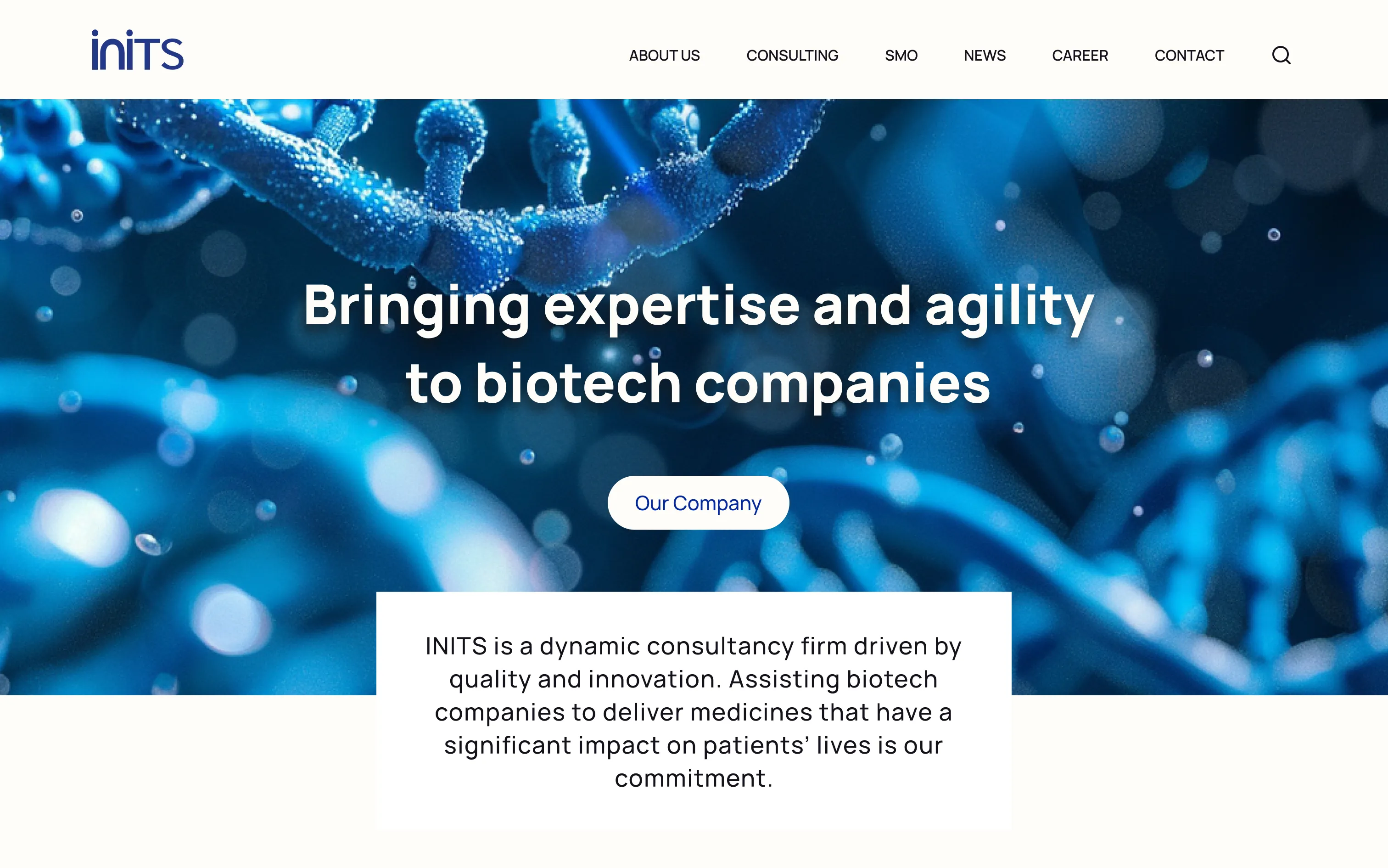
What shipped
No funnel to measure here — the result is the work itself, in production since May 2024.
3 → 1
brands unified
+2
sections the company never had
11
audit findings, each answered
In short
A consultancy whose website hid its expertise behind dense text and three competing logos.
The problem
Visitors could not tell what INITS did, or which of its services they needed. Three logos were in active use at once, and the company's newest offer — a shared manufacturing organisation — had no page of its own at all.
What I did
A heuristic audit, a competitor benchmark and a new information architecture, then the interface in Figma and the build in Framer — with the CEO and her team reviewing structure and wording as it took shape.
What came of it
The site is live. One identity replaced three, SMO went from a dead end to a three-page section, and the company gained somewhere to publish and somewhere to recruit.
A complete overhaul, not a new coat of paint
The offer was strong. The website was the thing standing in front of it.
INITS supports drug development — CMC, regulatory, quality assurance, clinical supply — and had spent three years building something genuinely unusual: a shared manufacturing organisation that hands biotech companies the keys to a production facility without leaving them to run it alone.
None of that reached the site. The inherited pages stated no value proposition and carried no proof, and the SMO offer existed as a single navigation item with nothing behind it. The brief was a full redesign: research and information architecture through interaction and interface design, then build and launch.
The audit: eleven problems, one root cause
Eight of them were the same problem wearing different clothes.
I scored the existing site against Nielsen's ten usability heuristics: eleven findings, each rated for severity and for how hard it would be to fix. Ten could be pinned to a heuristic, and eight of those ten came back to the same one — consistency and standards.
I scoped out usability testing, and I would make the same call again. This is a showcase site for a known B2B audience; the risk was not undiscovered behaviour but an offer nobody could follow. The audit, a benchmark of six competitors across thirteen criteria, and working sessions where structure and wording were reviewed as they took shape answered more than a test would have.
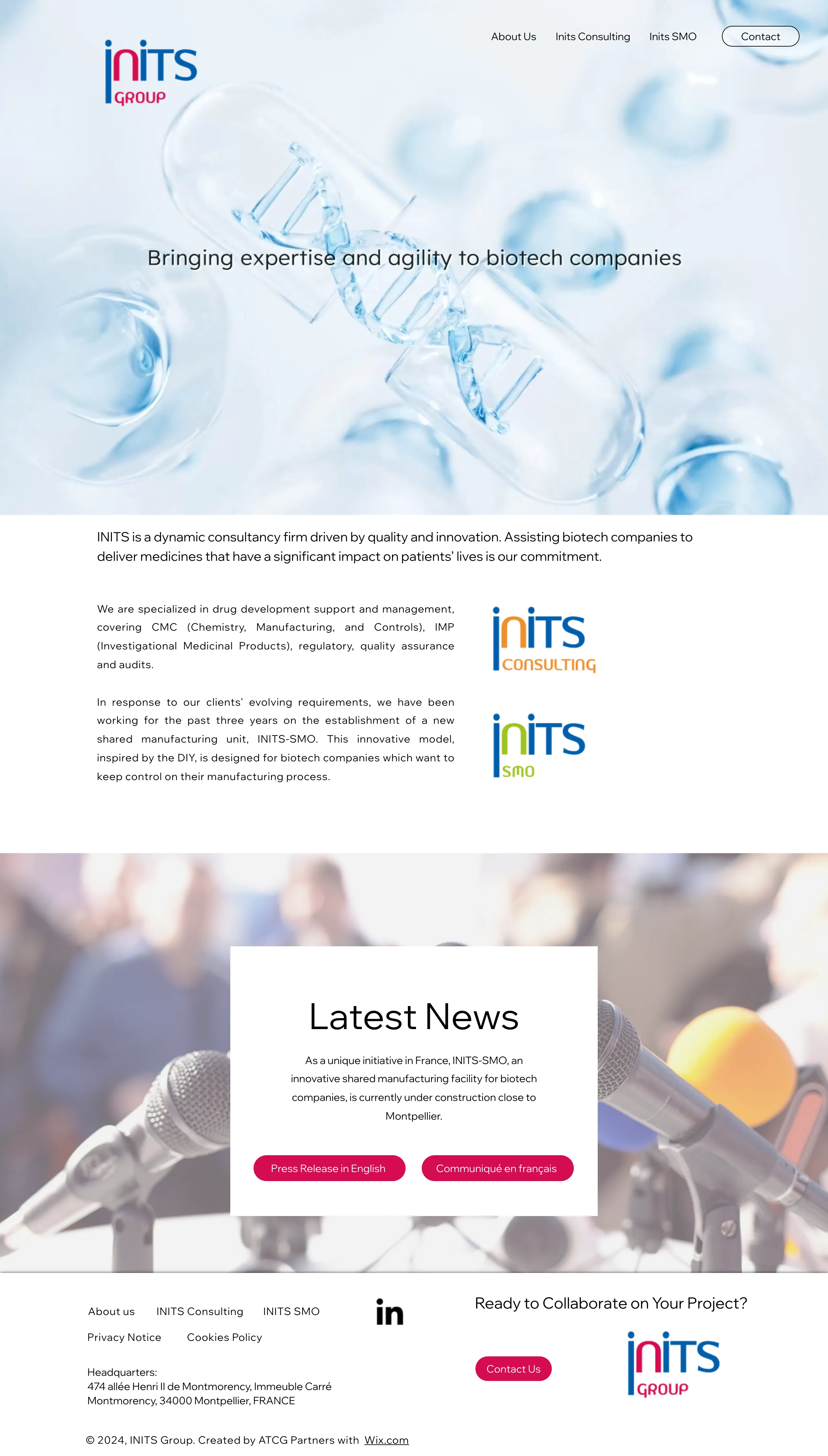
- 01
Navigation lost in the image
The header sits directly on imagery. Its contrast changes with the background, making the main routes hard to read.
- 02
A moving first impression
An autoplaying film competes with the tagline and adds weight to the page. This screenshot captures just one frame.
- 03
The offer takes work to understand
Dense, justified paragraphs bury the services. Visitors have to piece together what INITS can do for them.
- 04
One company, three identities
Group, Consulting and SMO use different marks and colours. Their relationship is unclear.
- 05
No consistent visual system
Thin button labels, uneven contrast and a disconnected footer weaken the hierarchy across the site.
What the CEO asked for
One session turned the brief into five wishes, and every later decision answered to them.
- 1
Pedagogy
“Most visitors aren’t drug-development specialists. Explain what we do, simply — pedagogy first.”
- 2
The SMO model
“SMO is new territory. Explain it: we hand clients the keys, but we never leave them alone.”
- 3
The people
“Clients come to see who works at INITS. Our experts stay — that’s rare in this market. Show them.”
- 4
The look
“Clean, clear messages, not too much text. And no videos.”
- 5
Signs of life
“We publish, we build, we go to congresses. The site should show we’re moving.”
“No videos” is the one that reached furthest. The inherited homepage opened on an autoplaying film with the tagline laid over it; cutting it settled the hero, the load time and the accessibility problem in a single decision. What took its place is a still image and, beneath it, a white panel stating what the company does — the first time the site had said so anywhere.
The market INITS was invisible in
A strong offer and a silent website. The benchmark made the gap impossible to argue with.
What visitors came for
- Accurate, detailed information on services and expertise
- Confidence that INITS can solve their specific problem
- Industry updates and signs of an active company
- Proof through case studies and success stories
- A clear, easy way to reach the team
What stopped them
- Confusing navigation and broken paths
- Thin, fragmented information about the offer
- Content visibly out of date
- No mobile version
- Slow loading
Six competitors, plotted
The benchmark ran across thirteen criteria, from regional specialists with the same spirit to global CDMO giants. On expertise and range of services INITS holds its own for its size. On two criteria its row simply read “nothing on the website”: collaborations and partnerships, and client feedback and reputation.
Those two blanks exposed a credibility gap. Every competitor was publishing news, naming clients and showing testimonials. INITS was doing the work and saying none of it — which is why the answer was never going to be a nicer-looking version of the same pages.
Visual assets, but no consistent identity
I also compared logos, palettes, typography and page layouts. Side by side, the gap was clearer: INITS had visual assets, but no consistent identity connecting them. Its three marks and competing colours made the company feel fragmented.
| INITSThe inherited site | CatapultColour-led continuity | MedaceRestrained consistency | CoaveScience-led imagery | |
|---|---|---|---|---|
| Identity |    The service identities pull the company in different directions. |  The same brand anchors different services and pages. |  A simple wordmark stays consistent across the site. |  A geometric symbol and wordmark anchor the visual language. |
| Colour | Accents divide the brands Colour changes with the mark, without a clear shared hierarchy. | A palette repeated across pages Blue and turquoise connect sections; other colours support them. | Neutral space, focused accents White space gives colour blocks and key actions room to stand out. | Contrast within one palette Dark blue, turquoise and warm neutrals connect light and dark pages. |
| Page structure | The treatment changes Image overlays, text blocks and footer treatments vary from page to page. | Colour creates a rhythm Repeated bands and content blocks make the pages feel related. | Space creates a rhythm Clear headings, open layouts and modular blocks carry across pages. | Imagery creates continuity Molecular motifs and diagrams keep the science visible across pages. |
Synthesis of my visual competitor analysis · colour samples are representative. See the full analysis ↗
INITS needed a shared set of visual rules: one mark, clear roles for colour, and repeatable page patterns. The two services could stay distinct within that system.
Three rules, and a new map
The audit, the workshop and the benchmark converged on the same three instructions.
Build trust
Stronger credibility signals, relevant imagery and a clearer explanation of what INITS actually does.
Unify the brand
Replace three competing logos with one identity, while keeping the two services distinct.
Reduce friction
Make navigation and page structure intuitive for visitors unfamiliar with the technical language.
Reducing friction turned out to be structural rather than cosmetic. The inherited sitemap gave five pages to Consulting and none to SMO — the company's newest and most distinctive offer was a label in the navigation with nothing behind it. Redrawing the map is what made room for the SMO story, and for the two sections the business had never had.
Restructuring the information architecture
Before
- About Us
- Who We Are
- Meet Our Team
- INITS Consulting
- How We Work
- CMC
- Regulatory
- IMP
- Quality Assurance
- INITS SMOA service in the navigation, but no pages to explain it.
- Contact Us
- Press releases
- English
- Français
After
- About Us
- Our Company
- Meet Our Team
- Our Collaborations
- Consulting
- How We Work
- CMC
- Regulatory
- IMP
- Quality Assurance
- SMO
- Why Choose SMO
- A Dedicated Space
- Services
- NewsPress releases join the main navigation.
- CareerA new entry point for future team members.
- Contact
New or newly given a page of its own.
One brand, two services
From a fragmented identity to a shared visual direction.

Finding the visual direction
I explored a direction around innovation, customization, credibility and expertise. Scientific imagery brought the biotech context; laboratories and people grounded it in real work.
The moodboard explored a wider range of colours and textures than the final site. Blue, violet and magenta became the basis for a shared identity.
Turning exploration into a system
One INITS logo replaced the three competing marks. Deep blue gives the site its structure; violet identifies Consulting and magenta identifies SMO. The services stay distinguishable while the company reads as one.
Before · three marks


After · one identity

Colour carries the two services
- INITS blueStructure — nav, headings, links#05299E
- ConsultingThe advisory service#7E0CF5
- SMOThe shared manufacturing service#CD4DCC
What the redesign did
A clearer story, from the first impression to the next step.
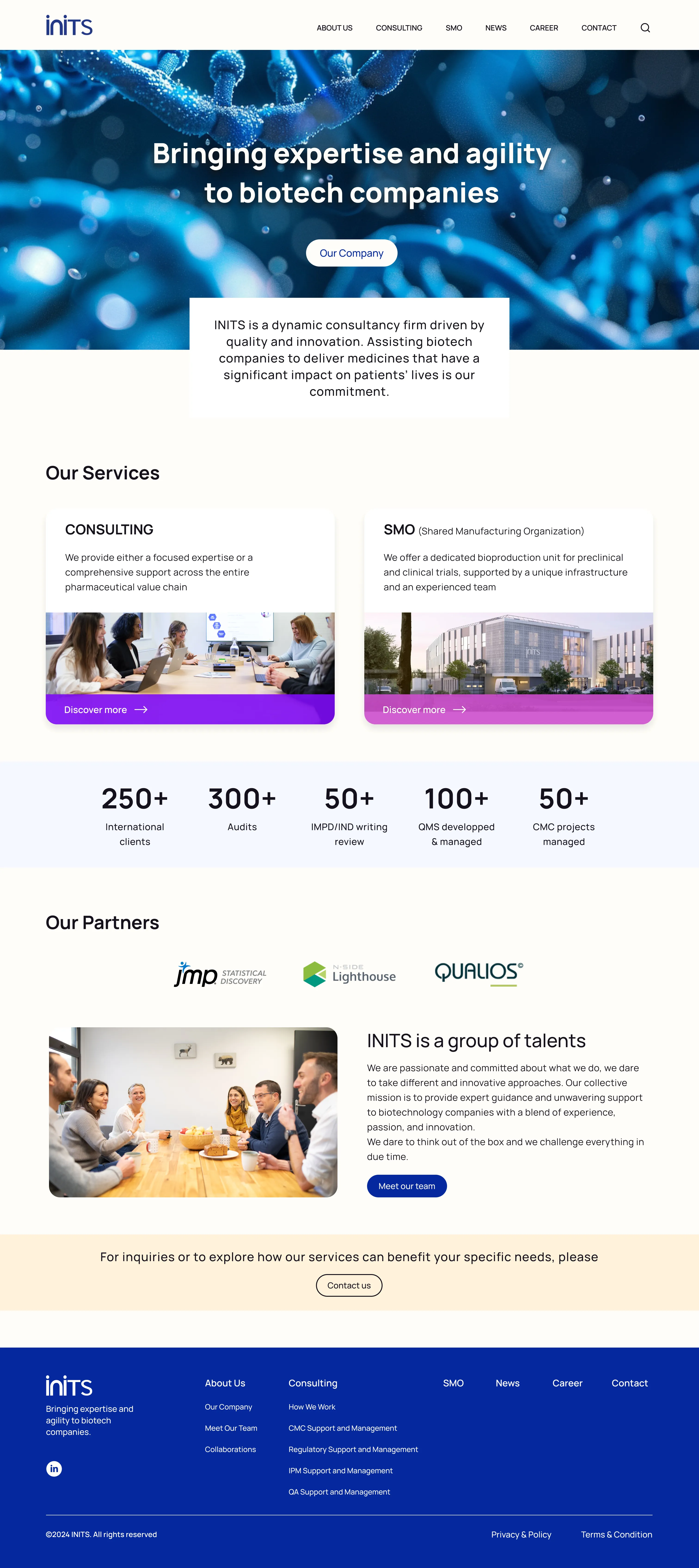
- 01
One identity. Clear navigation.
One INITS mark and a solid white navigation bar give every page a consistent, readable starting point.
- 02
A calmer introduction
A still image replaces the film. A separate white panel gives the company introduction its own space.
- 03
Two services, plainly explained
Consulting and SMO sit side by side. Violet and magenta distinguish the offers within one shared identity.
- 04
Experience made tangible
Client, audit and project figures turn broad claims of expertise into concrete proof points.
- 05
Partners named, people shown
Collaborations and the team appear on the homepage, making the people behind the expertise visible.
- 06
A consistent path to contact
Shared cards, buttons and a structured footer carry the same hierarchy through to the end of the page.
The experience in context
The same rhythm applied to very different content — and two sections the company had never had.
Every page carries the same navigation, hierarchy, cards and calls to action. CMC stays information-rich without becoming overwhelming; the longer SMO page combines the facility, the benefits and the operational detail in one readable journey.
News and Career were new. They answer the CEO's fifth wish — signs of life — and mean recruitment no longer has to happen entirely off-site. I designed the site in Figma and built it in Framer myself, so what shipped is what was designed.
Live since May 2024.Visit the live site ↗
Reflection
Three things I took from this one.
When the audience is not specialist, pedagogy is an information-architecture problem before it is a copy problem. The SMO offer did not need better words so much as pages to put them on.
The audit scored eleven problems and eight of them traced to one heuristic. Counting them was what turned “the site feels dated” into a brief the CEO could agree to in one session.
I would push harder on measurement next time. This shipped without instrumentation, so I can show what changed on the page but not what changed for the business — and that is the half a client remembers.