MDW Formation — making workplace learning easier to find and use
In six months, I helped redesign and ship a bilingual training platform that clarified its offer and simplified access to live sessions within SharePoint Online.
Product Designer · two-person design team · Nov 2024 – Apr 2025 · a leading French banking group · SharePoint Online · international, English & French
Read the story ↓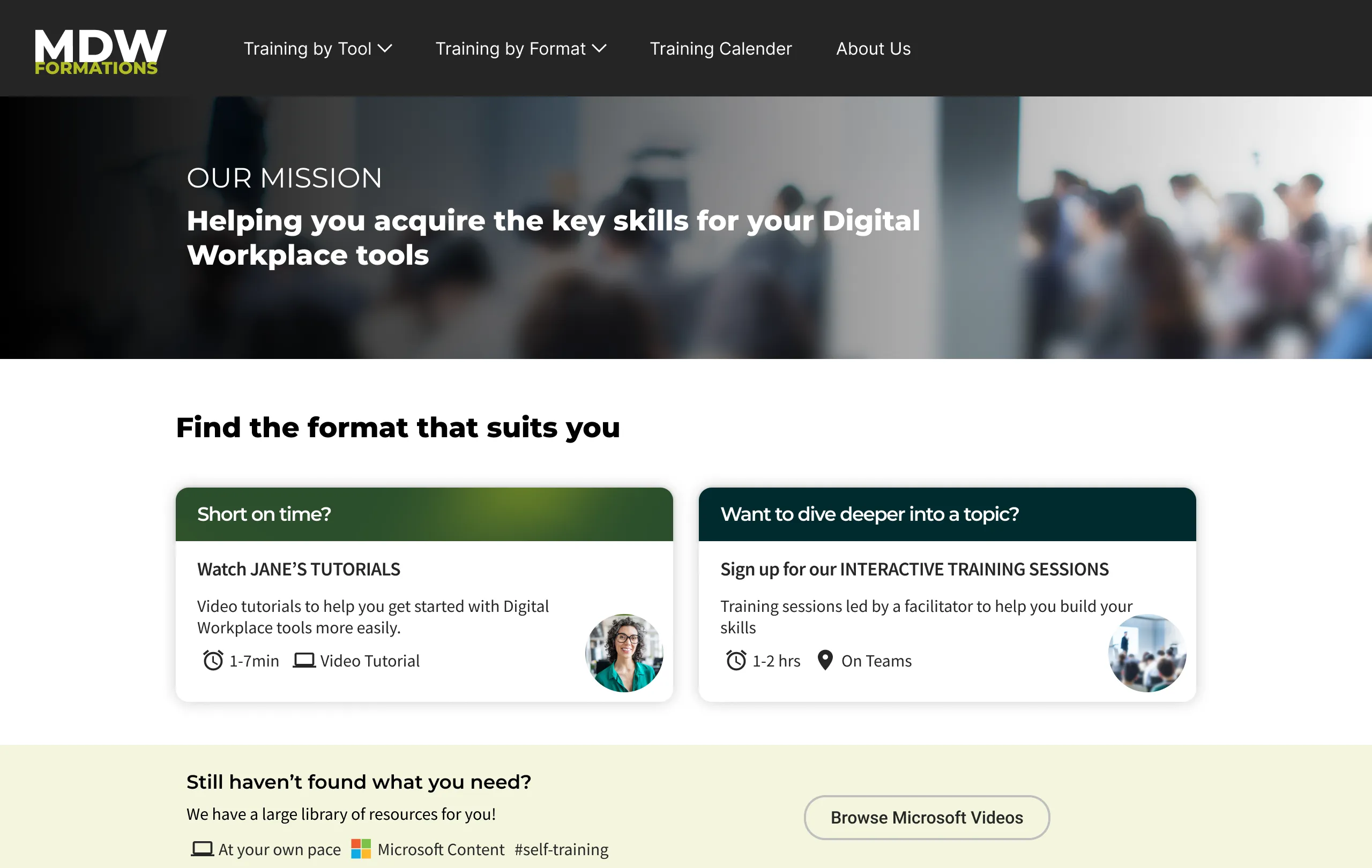
What it changed
Reported after launch. Traffic compared year over year.
2×
unique visitors, year over year
3×
visitors to Jane's Tutorials
80%+
found registration easy, up from 70%
01In short
The project at a glance.
The problem
The site was hard to find and difficult to use. Complicated navigation, unclear labels and dense pages made it hard for employees to understand the training options or know where to go next.
My contribution
Alongside a Lead Product Designer, I worked on the audit, journeys, wireframes, UI, testing and implementation follow-up. We developed strategic framing and key decisions collaboratively with stakeholders and the training team.
What changed
A clearer hierarchy, routes by tool and format, and earlier visibility of live sessions.
02A training offer hidden by its platform
Employees valued the training, but low awareness and unclear navigation made it hard to find.
My Digital Workplace serves more than 100,000 employees at a leading French banking group. MDW Formation is its training service for everyday workplace tools.
The service brought together instructor-led sessions, in-house video tutorials and Microsoft resources. The audit examined how employees understood and navigated these options.
Main problems identified in the audit
- Low awareness — employees did not know the platform existed, or what it was for.
- An unclear value proposition, with no statement of what the site offered.
- Oversized navigation, repeated information and long pages that demanded heavy scrolling.
- Weak distinction between the three learning formats.
- Live-session availability buried inside individual tool pages.
03Prioritizing the training employees valued
We chose to lead with internal training and keep Microsoft resources as a supplement.
Two workshops brought stakeholders, selected end users and the design team together to clarify MDW Formation’s purpose. The themes resolved into two strategic objectives that guided the redesign.
The research synthesis recommended highlighting the internal offer instead of giving all three formats equal weight.
Microsoft's library was barely known, visually inconsistent with the rest of the site, and often not recognised as Microsoft's at all.
Workshops’ findings
- Make the site easier to reach — visibility
- Simplify registration for live sessions
- Make the platform attractive and easy to use
- Give the learning experience dedicated, progressive journeys
- Give the offer a stronger, more coherent identity
Strategic objectives
- Re-position MDW Formation as the reference platform for training on Digital Workplace tools.
- Help every employee reach a minimum level of confidence in the tools they use at work.
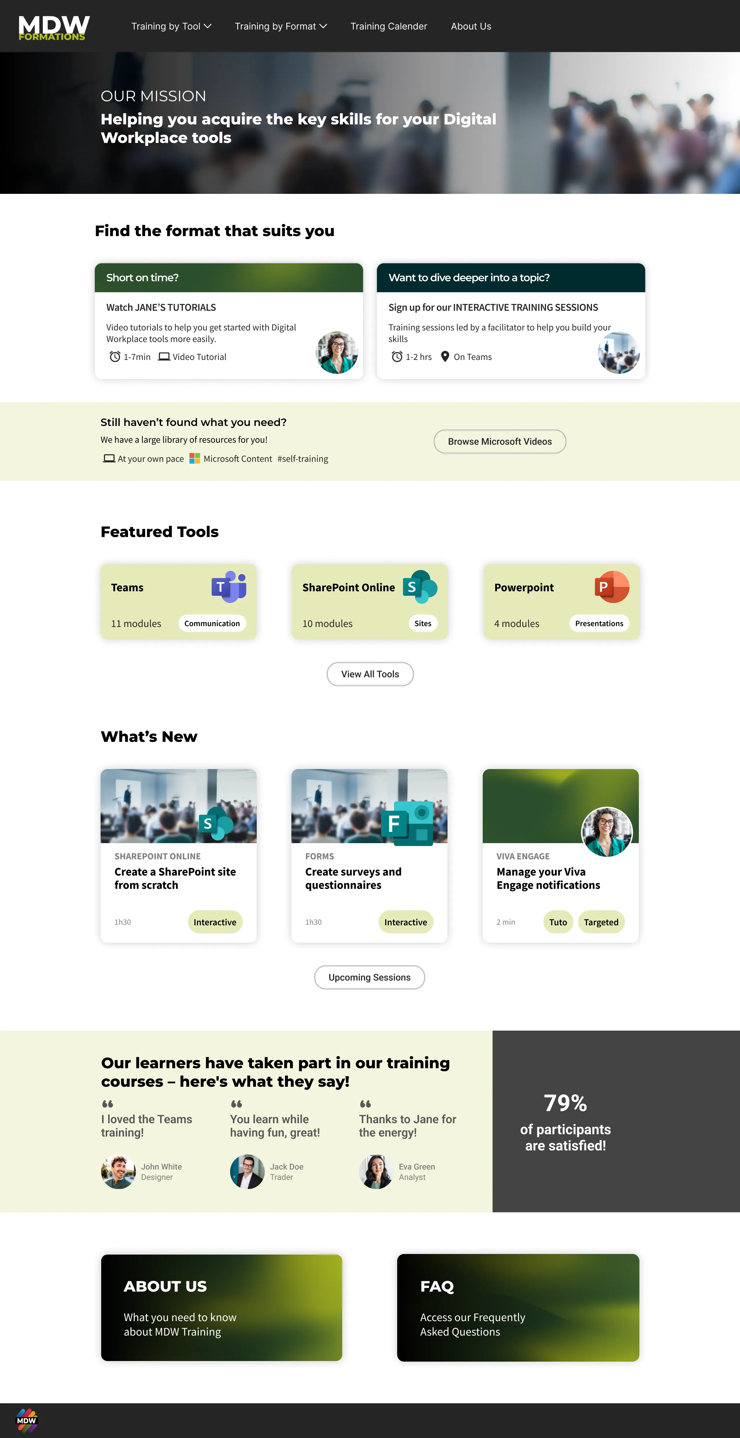
The homepage presents that hierarchy in three levels:
Short on time
Jane's Tutorials
Short, targeted videos made in-house. Highly valued in research, and the quickest way to answer a specific question.
Want to go deeper
Instructor-led sessions
Live sessions with an internal trainer who adapts the pace and answers questions. The offer’s distinctive value.
Still need more
Microsoft's library
A large external resource library, presented as a supplement — not as a pillar of the offer.
- 01
Explain the choice
Duration and delivery mode distinguish a quick tutorial from a live session before the first click.
- 02
Give internal training priority
Microsoft resources remain available in a quieter band. Research supported keeping them as a supplement to the internal offer.
- 03
Carry the hierarchy into discovery
Featured training uses the same format and duration cues, with a route to upcoming sessions.
04Supporting discovery by tool and by format
The architecture supports two starting points: a tool to learn, or a preferred format.
Most participants started with a tool they needed help with; others wanted to browse by learning format (live sessions with an instructor, short tutorials or Microsoft resources). We made both routes available in the menu and on the homepage.
By tool
By format
Adapting the structure to the size of the catalogue
We compared use-case lists, thematic grouping and format grouping to balance immediate scanning with catalogue growth.
Small collections: one list
For fewer than five courses, the synthesis favoured a single list. Employees could scan the topics together, then compare formats and time commitments.
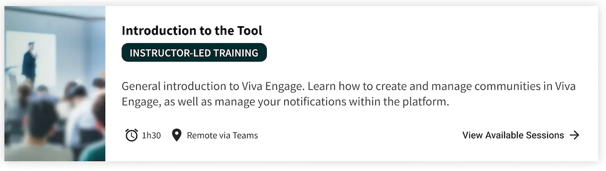
On the Viva Engage page, tutorials and live sessions share one list. Microsoft resources remain available at the end.
Larger collections: group by tool
When a tool has a lot of training content, expandable groups keep the catalogue easy to browse without a long scroll.
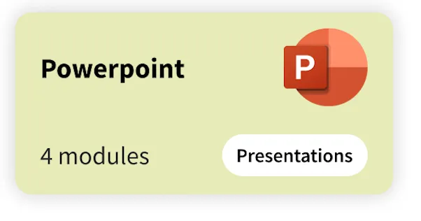
Each group is labelled with the tool name and module count. Expanding it reveals all the training for that tool, from live sessions to tutorials, so employees can explore one tool at a time.
05Reducing uncertainty before registration
We clarified the choices before the external registration service, which remained outside our scope.
I mapped the journey to identify where employees lacked information before committing to the next step.
The comparison below highlights those moments of uncertainty.
Before
- MDW FormationHomepage — check featured upcoming sessions
- MDW FormationIf no featured session fits, open a tool page to check for traininguncertain
- MDW FormationSearch the page for a future sessionuncertain
- Registration serviceFollow the link to the registration service
- Registration serviceCheck availability, then register or join the waiting list
- OutlookReceive the invitation by email
When no training was available, the mapped fallback route led through Microsoft resources and tips before reaching internal tutorials.
After
- MDW FormationHomepage — upcoming instructor-led sessions surfaced herenow visible earlier
- MDW FormationOpen the training tool tile
- MDW FormationPick an upcoming session — date and time visiblenow visible earlier
- Registration serviceFollow the link to the registration service
- Registration serviceCheck availability, then register or join the waiting list
- OutlookReceive the invitation by email
When no session fits, the fallbacks follow the hierarchy: tutorials first, then the Microsoft library, then tips.
The source journey already included featured sessions on the homepage. The redesign made internal training and tutorials more prominent and clarified session details; external registration and email remained unchanged.
Date and time, together
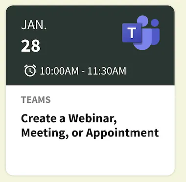
Date and time appear together so employees can judge whether a session fits their day.
Tool logos make the list easier to scan by product. Collapsible groups keep the other tools visible while people explore the sessions they need.
06Testing for clarity and scannability
Two rounds of testing helped us make training easier to understand, compare and access.
We ran 19 remote sessions over Microsoft Teams: eight in the first round and eleven in the second. I prepared the protocol and prototypes, ran and supported sessions, and synthesised the findings through affinity mapping.
Participants completed the tasks, but unclear labels and dense pages made choices harder than they needed to be. We clarified the learning formats and registration actions, reduced visual clutter, and made course topics and durations easier to scan.
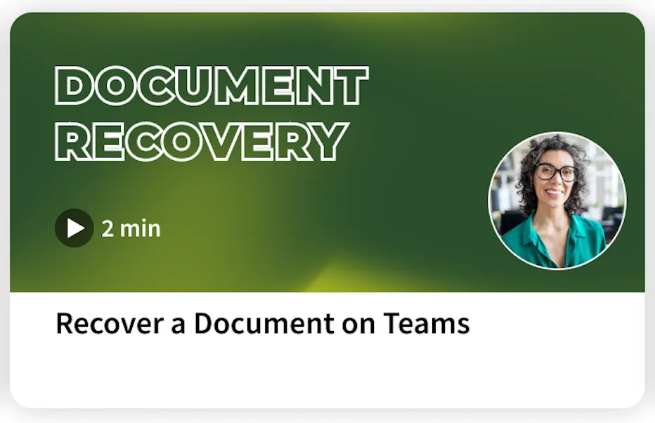
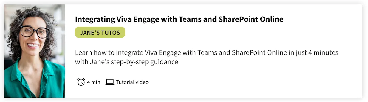
A thumbnail per tutorial
Testing showed that each tutorial needed a clearly distinct title so employees could recognize its topic at a glance.
Each thumbnail now highlights the tutorial’s topic and duration, making the options easier to scan.
07Designing within SharePoint constraints
We worked with SharePoint’s constraints throughout design and implementation.
The training team would build and maintain the site in SharePoint Online. Some constraints remained, including the confusion caused by two stacked navigation layers.
We focused on shorter pages, clearer headings and less dependence on persistent navigation.
| Design constraints | Design responses |
|---|---|
| No sticky site navigation. | Shorter pages and clear headings help people stay oriented. |
| Limited control over spacing. | Kept small spacing compromises so the team could maintain the site. |
| Registration happens in an external service. | Clarified the steps before registration, keeping the external service in place. |
08A system the training team could keep running
The training team needed patterns they could reuse as the catalogue grew.
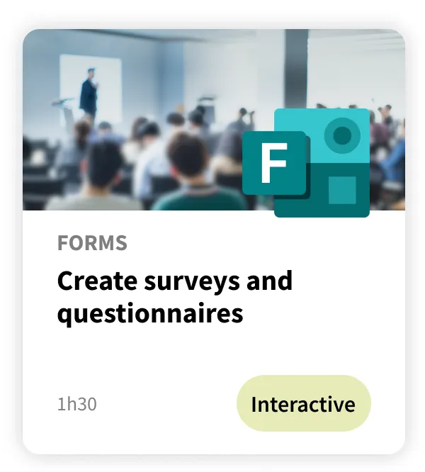
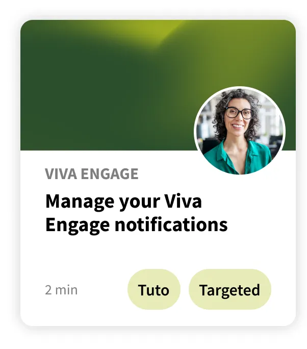
I created reusable Figma components so the training team could update session titles, dates and content, then export the assets for use in SharePoint Online. This helped them keep the catalogue consistent as the offer evolved.
09What changed after launch
Traffic increased after launch. These signals do not isolate the effect of design alone.
2×
as many unique visitors as the previous year.
3×
as many visitors to Jane's Tutorials — the format research had told us to promote.
+10pts
at least: the share of visitors who found registering for a session easy rose from 70% before the redesign to more than 80% after launch.
Post-launch feedback
- Clearer and more relevant than the previous MDW training offer.
- Smooth navigation, clear site map. Simple access to the information.
- Great UX/UI experience — the journey is fluid and simple.
- The portal has had the refresh it needed.
10Reflection
One decision to repeat. One question to investigate next.
I would repeat the work on offer hierarchy before refining screens. Clarifying the role of internal training and Microsoft resources gave the homepage, tool pages and fallback journey a shared structure.
I would next investigate finding training by use case. Feedback requested text search; I would study the tasks and words employees bring to the platform before deciding how search should work.