The challenge
CNP’s brief focused on inadequate insurance: missing protection, duplicate cover and exclusions discovered too late.
Making insurance understandable through playful learning and clear, proactive protection for young adults.
Product Designer · Leading a team of four · Two months · 2026
Hackathon brief from CNP Assurances · Concept to prototype
Learn from the first interaction. Understand what protects you.
CNP’s brief focused on inadequate insurance: missing protection, duplicate cover and exclusions discovered too late.
I divided responsibilities, facilitated workshops and made scope decisions, while designing hands-on from research synthesis to the final prototype.
A prototype that introduces playful learning at registration, then helps people understand and manage their cover, supported by a reusable design system and delivery plan.
We conducted five moderated interviews, each lasting 45–60 minutes, remotely and in person. We explored three hypotheses: legal language blocks understanding, fragmented contracts hide overlaps, and immediate expenses push insurance down the list. The interviews gave us concrete examples of all three.
Secondary research highlighted difficulty understanding policy terms and unnoticed duplicate cover. Customer reviews echoed confusion about guarantees, fear of hidden exclusions and frustration with slow or unreachable support. Together, these sources shifted our focus towards helping people understand their existing protection before choosing more.
“It’s legal terms… you’d basically need to be a lawyer to know what you’re actually covered for.”
Explain guarantees in everyday words, with visible amounts and exclusions.
“I paid €12 a month into the void for six months for a phone that was already insured. It drove me crazy.”
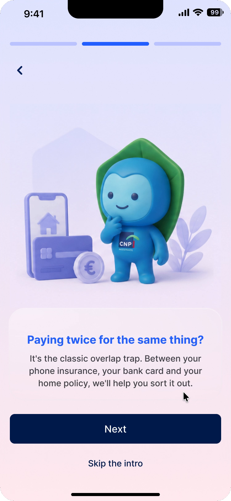
Bring contracts together so people can see what they already pay for.
“If I have to choose between eating properly and paying for insurance, I cut the insurance straight away.”
Make the value of protection concrete before asking for a commitment.
Our interview synthesis revealed a gap between having insurance and understanding it. Participants described signing without reading complex contracts, choosing the cheapest or mandatory cover, and struggling to see what their monthly payments provided. They wanted clear explanations of what they were paying for and reassurance about exclusions.
We grouped these behaviours into three personas and focused on a shared life moment: a first home, a first car or managing a budget independently. Limited money and unfamiliar terms made guidance especially valuable here. Thomas, the “blind signer”, brings this tension into the journey below: he wants protection quickly, but cannot explain what his policy covers.
A scenario based on the behaviours found in our interviews.
Thomas needs glasses; money is tight.
He cannot decode his optical cover.
A flatmate, then AI, interpret the clauses.
He calls the insurer and gives up waiting.
He buys cover he already had.
We used an impact–effort matrix to set the first release. Gamified learning was a deliberate high-effort priority: mini-quizzes, explanations, XP and streaks were designed to make a difficult subject approachable and encourage a learning habit, starting at registration.
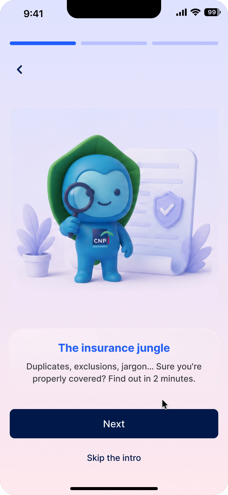
An introductory mini-quiz starts the experience. Short lessons, daily challenges, XP and streaks give people a reason to keep learning.
The community help forum was deprioritised.
MVP refers to the proposed release scope. The hackathon deliverable was a prototype; illustrated alerts do not demonstrate a working detection service.
Yumi
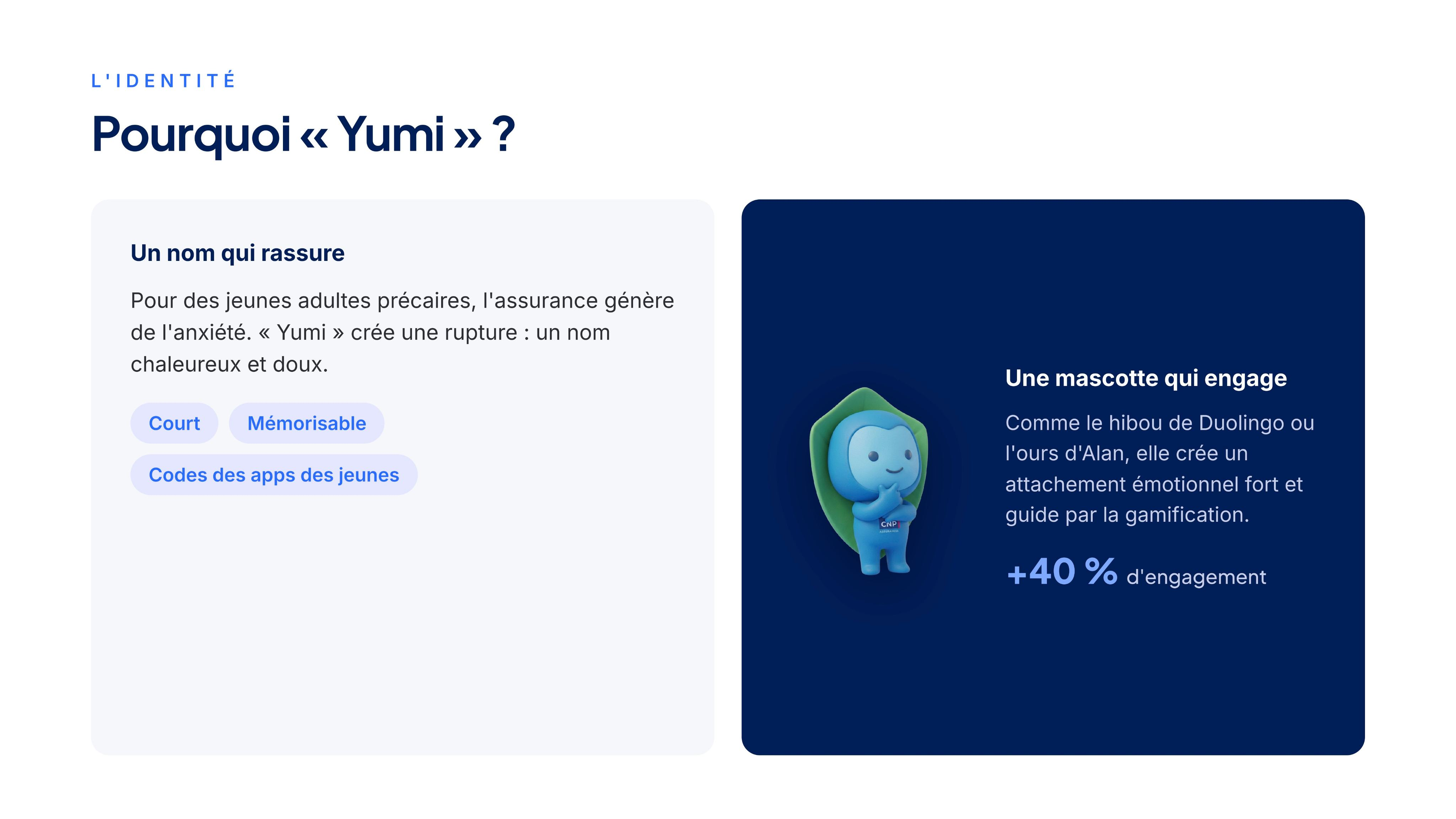
We created the name Yumi as part of our response to CNP’s brief. For young adults already anxious about insurance and money, we wanted a name that felt warm and gentle: short, easy to remember and familiar among the apps they use.
The guide character extends that intention through the experience. A familiar companion introduces insurance through the first mini-quiz and celebrates progress, bringing warmth to the gamified learning experience.
As soon as someone registers, Yumi introduces learning through a mini-quiz. Answering a short challenge, discovering the explanation and earning XP makes the product’s educational purpose tangible from the beginning. Streaks and daily quizzes are designed to encourage a return to learning over time.
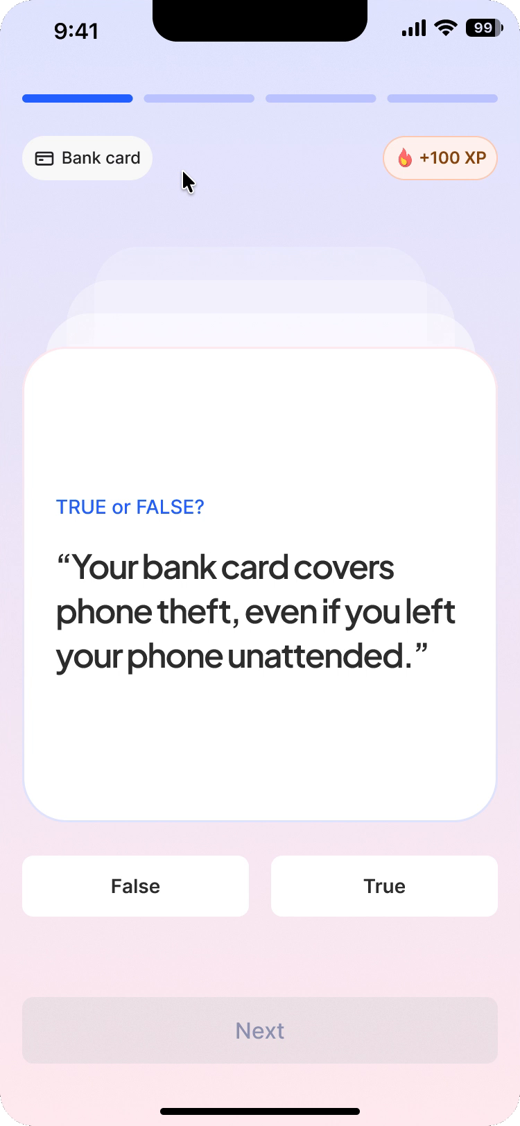
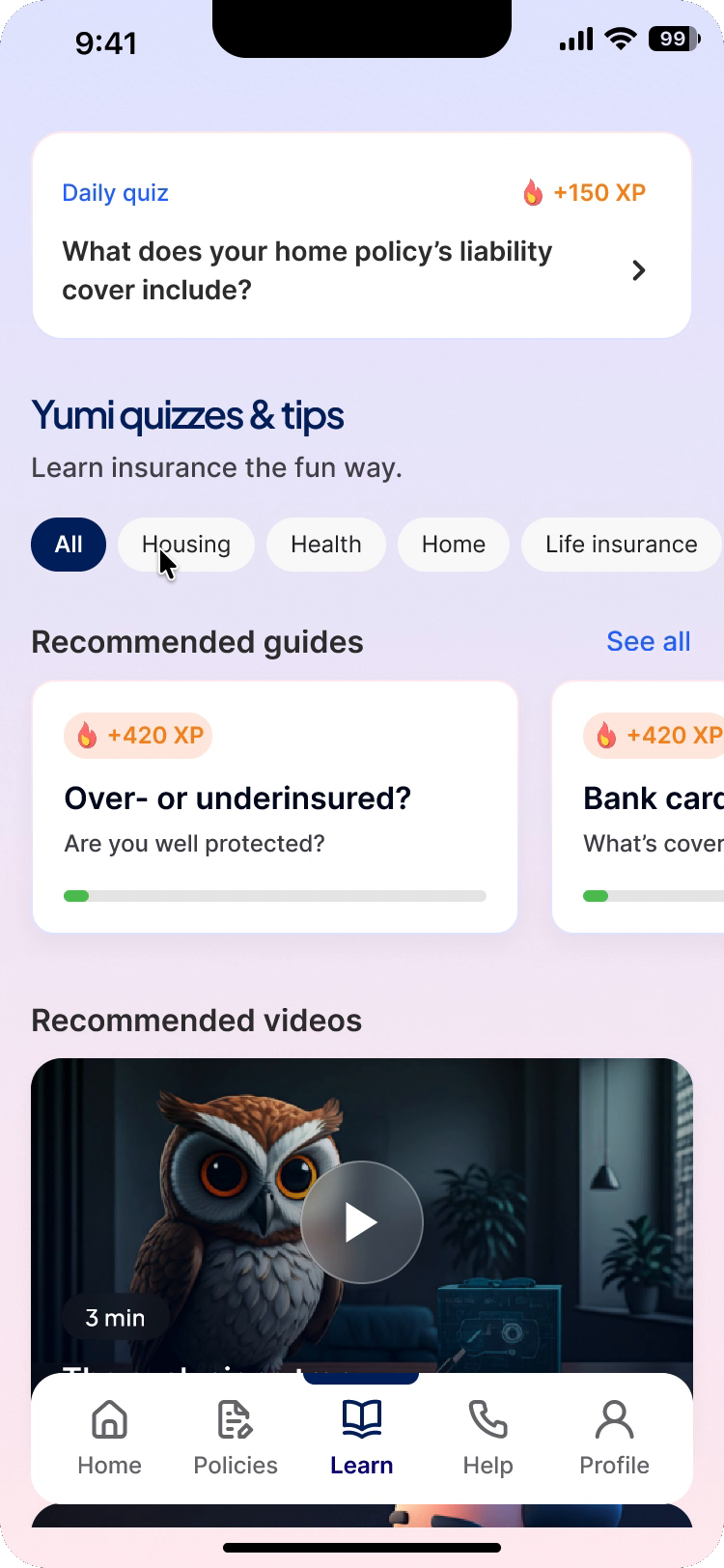
The design intention is sustained learning. Testing would need to establish whether people return, retain what they learn and apply it to their own cover.
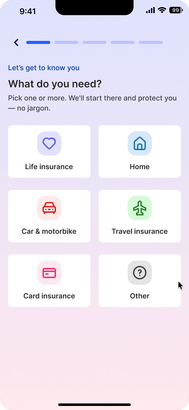
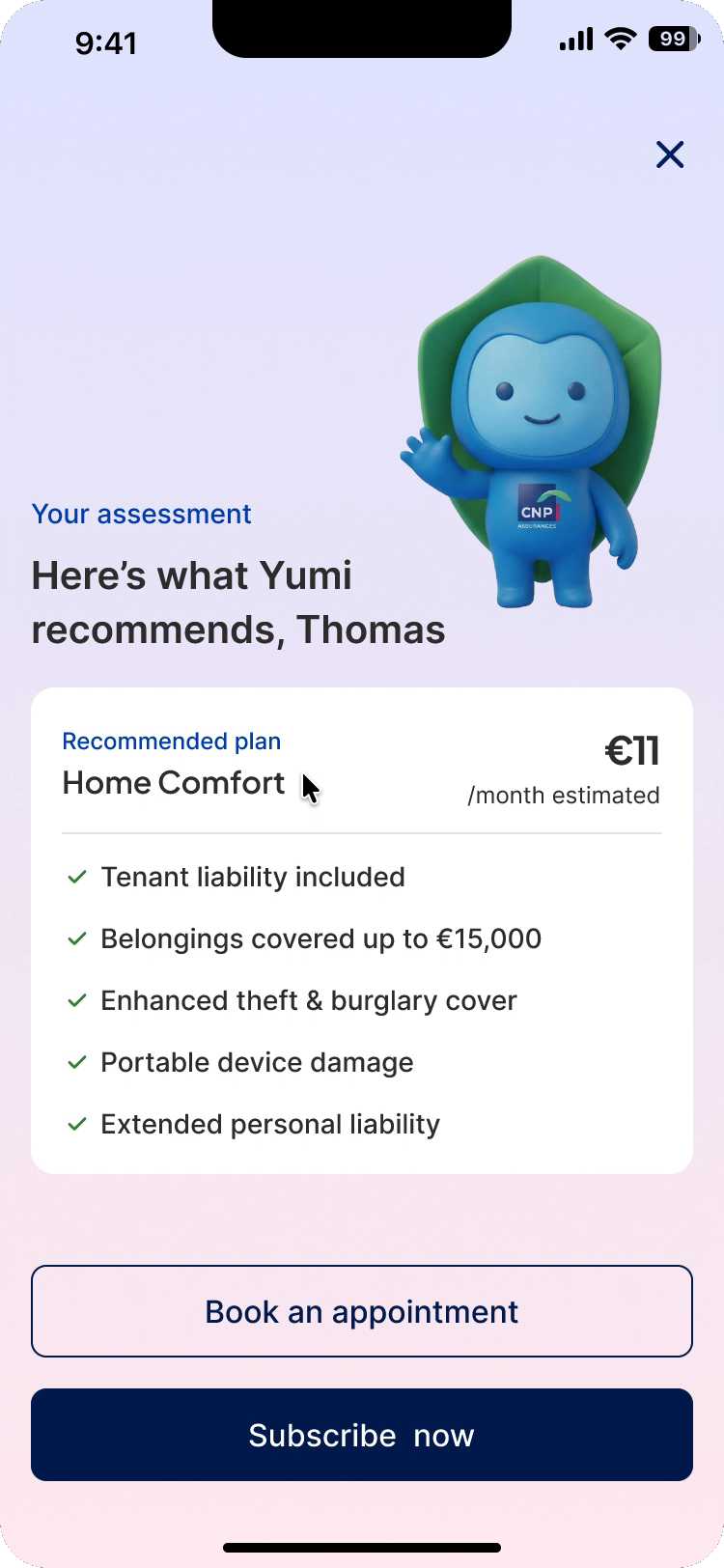
The diagnostic starts with familiar details, such as housing and priorities. The recommendation then names the guarantees and their amounts, with a route to a human appointment before subscribing.
The dashboard surfaces contract status and actions needing attention. A shared card pattern lets people scan their policies; the detail view separates covered risks, reimbursement limits and exclusions.
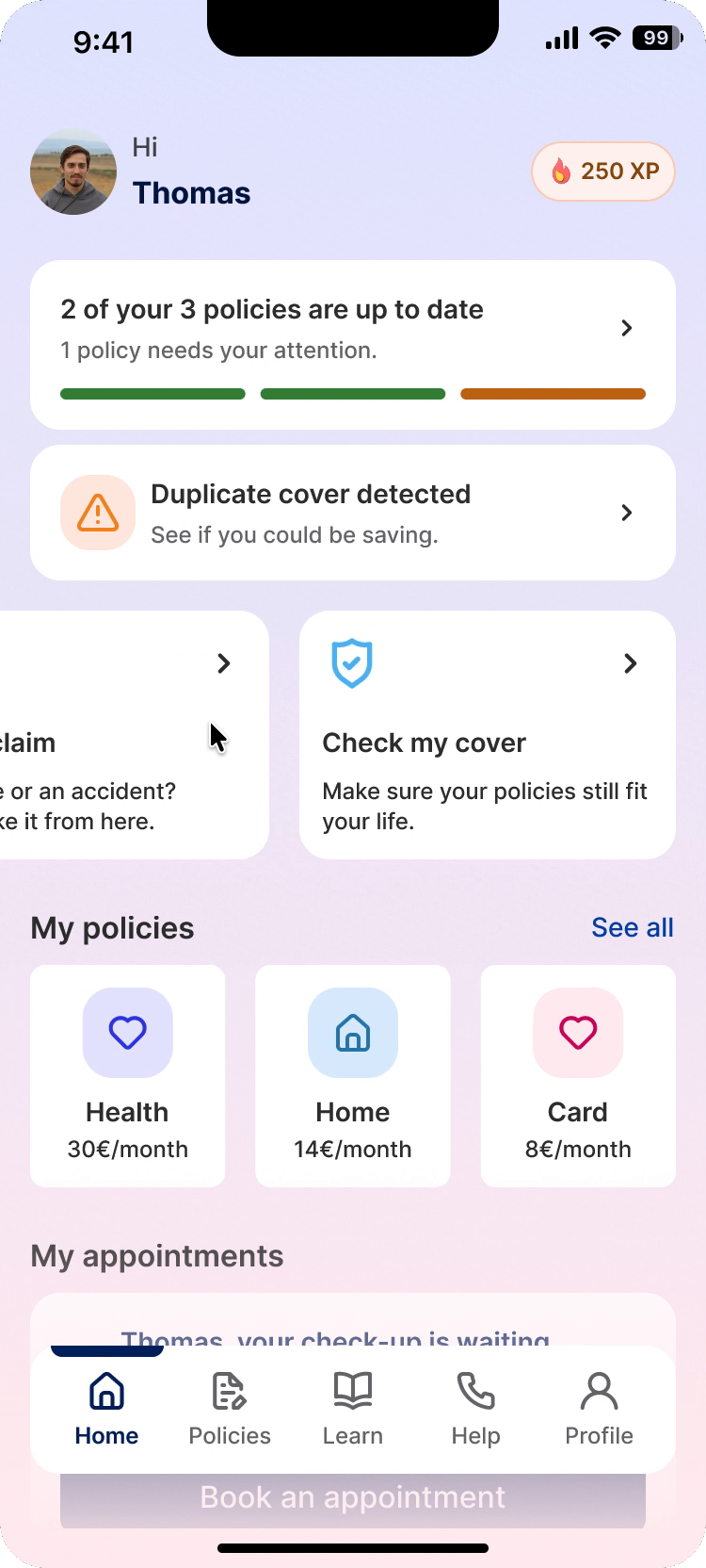
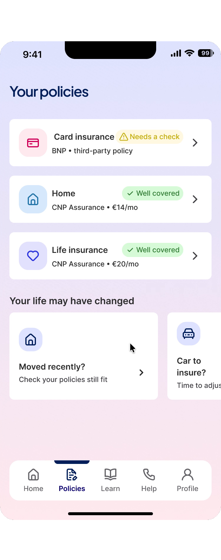
CNP’s navy, sky and pink carry into Yumi. Status colours and reusable patterns give dense information a consistent structure, while the guide character brings warmth to unfamiliar decisions.
Buttons
Form fields
Coverage & progress
Check if you could save.
Iconography


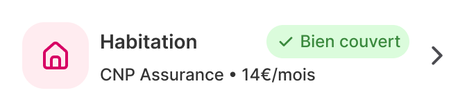
Contract card
CNP Assurance · €14/month
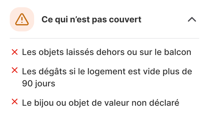
Coverage disclosure
Navigation
The pedagogical direction resonated most with CNP: an established insurer could help young adults understand the vocabulary and make more informed decisions. Introducing mini-quizzes at registration and supporting continued learning with gamification made that direction tangible in the prototype.
For me, the key lesson was about prioritisation: an effort matrix supports a decision, but the product’s purpose has to guide it. Here, removing the expensive feature would also have removed what made the proposition distinctive.