Human support offers a reason to return
A guide, an appointment and a group can provide continuity beyond reminders or counters.
A place to find a guide, join a live session and build a practice that fits your life — with room to close the app.
Research, product concept, UX/UI & walkthroughs · 2025–2026
Read the story
The research behind it
Exploratory research, not product-impact metrics.
189
survey responses
4
interviews: 3 users + 1 expert
6
mindfulness apps compared
The design challenge: support a regular practice without making attention another thing to capture.
My own experience of isolated meditation sessions contrasted with an eight-week mindfulness programme: a group, a guide and a framework made the experience different. That experience led me to explore how a digital product could bring the same sense of guidance and connection into everyday practice.
I combined a survey, user and expert interviews, a six-app comparison and theoretical research. I translated the findings into product principles, high-fidelity screens and recorded walkthroughs for Pauze.
A concept centred on human guidance, live practice and a gentle return to everyday life. The deliverable is a design proposition; its usability and effect on sustained practice remain to be tested.
The survey showed a gap between the need for support and the tools people actually used. The interviews helped explain it: people needed time, structure and human connection, without pressure to fit into a wellness culture.
Lack of time and structure were barriers to continuing.
rated their stress at least 3 out of 5
turned to people close to them to cope
used a meditation app to manage stress or anxiety
The need was often a framework to return to, rather than more content to consume.
A guide, an appointment and a group can provide continuity beyond reminders or counters.
The need was a way to restart without guilt, rather than a streak or a score.
Short, informal moments let people practise without adopting an identity or a perfect routine.
Human interaction can normalise resistance and make it easier to keep exploring the practice.
Research scope: 189 self-reported responses; 85% women, 92% urban residents and 55% aged 26–35. The three user interviews involved women aged 30 recruited through personal connections. These findings frame a concept, rather than represent a population.
How might a digital product support an authentic, regular and lasting practice of mindfulness?
I compared Headspace, Calm, Petit BamBou, Insight Timer, Smiling Mind and Meditopia across eight criteria. The study examined guidance and content alongside attention capture, performance cues and business-model transparency. It led to three principles for Pauze.
Make teachers, live sessions and groups visible in the main journey. A relationship and an appointment offer a framework for returning.
Let people choose a rhythm, restart after a break and finish without a score. A useful session can end with leaving the app.
Keep the offer legible and the language direct. Carry the same restraint into notifications, data collection and the paid model.
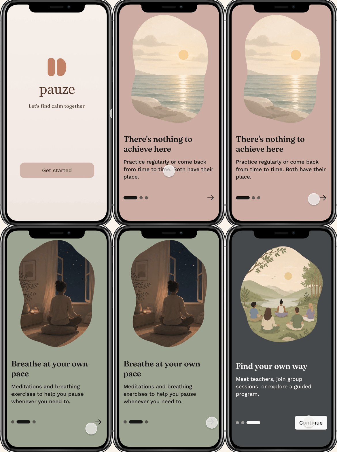
The first screens establish the relationship before asking for preferences. “There’s nothing to achieve here” makes room for occasional practice. “Breathe at your own pace” introduces short formats. “Find your own way” opens the door to a teacher or a group.
Muted terracotta, sage and charcoal distinguish the three messages. Quiet illustrations and generous space give each idea room, while the copy sets expectations about the practice itself.
Ask about the support someone wants and the time they have, without requiring them to adopt an identity.
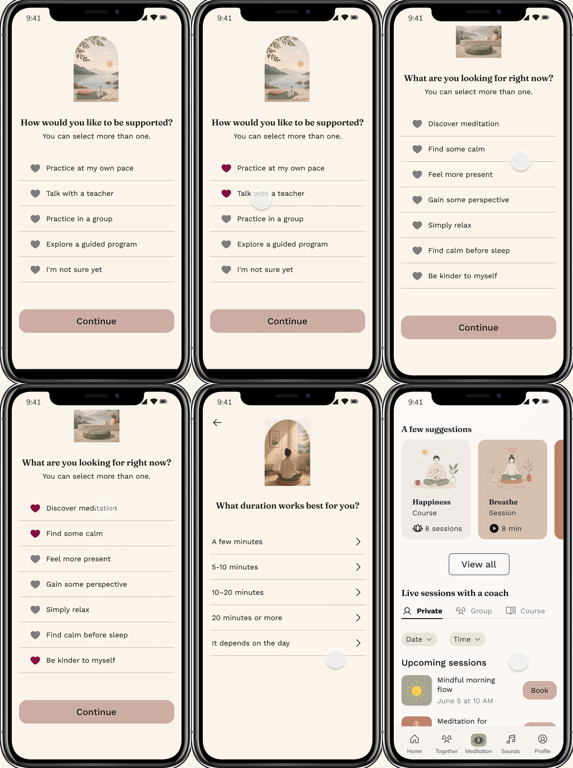
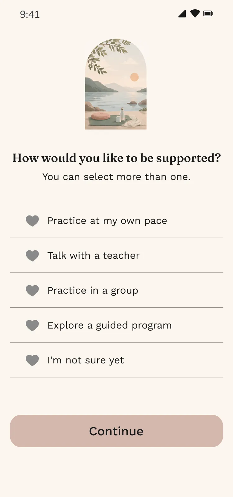
The concept asks about preferred support, current intention, time of day and duration. “I’m not sure yet” and “It depends on the day” acknowledge uncertainty. The aim is a manageable starting point for someone who needs structure but whose routine can change.
A next iteration should make every question explicitly skippable and explain how answers affect suggestions. These improvements remain to be explored in the next version of the concept.
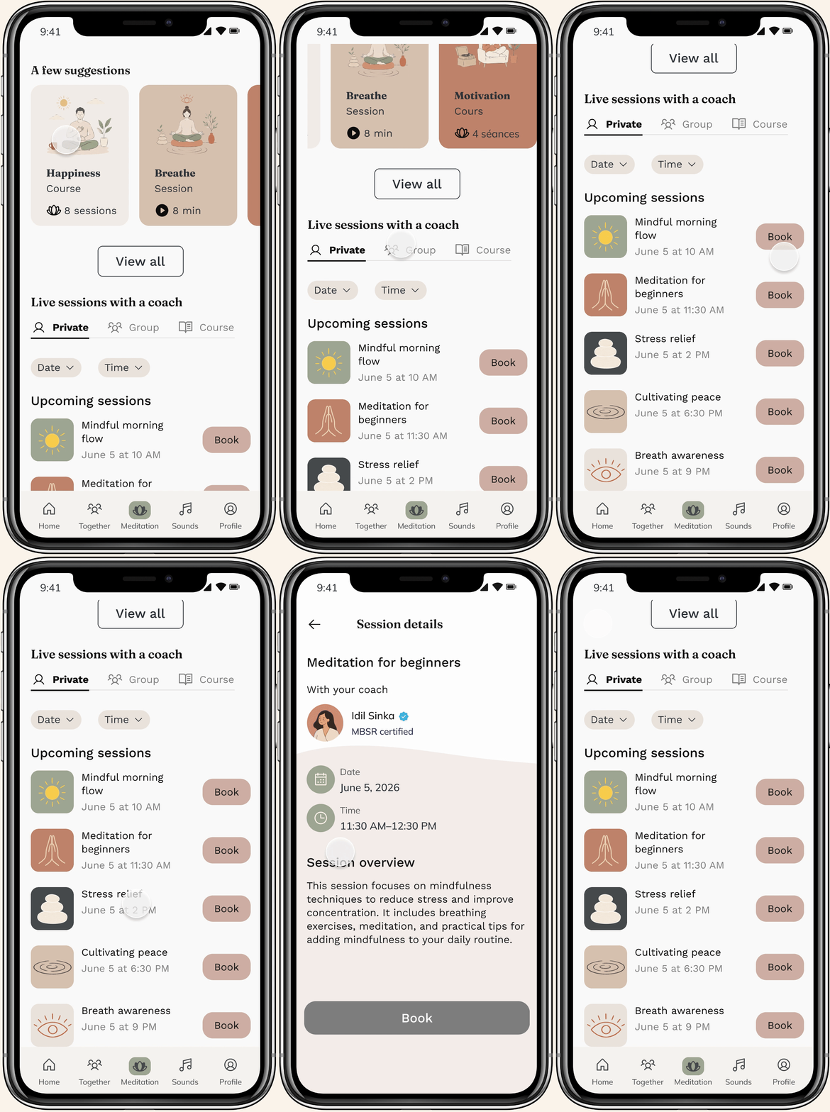
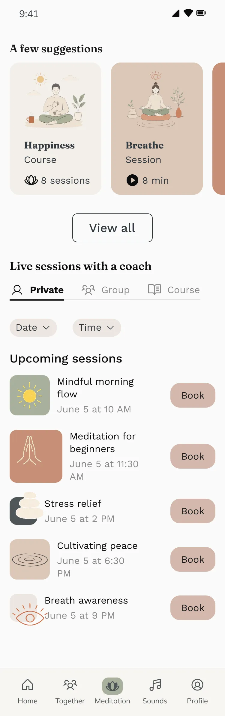
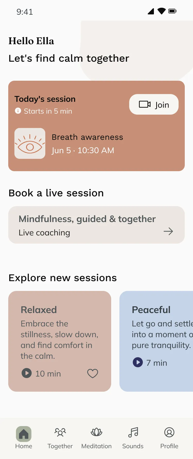
After onboarding, users arrive on a personalized homepage with suggested practices and upcoming live sessions. Their preferences provide a starting point for choosing what to try.
Selecting a session opens its details: the named teacher, date, time and description. Users can understand what the session offers before deciding to book.
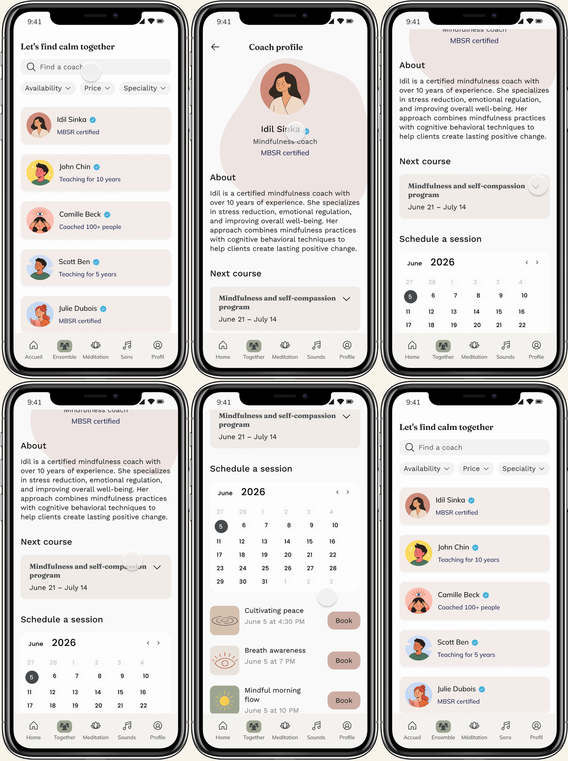
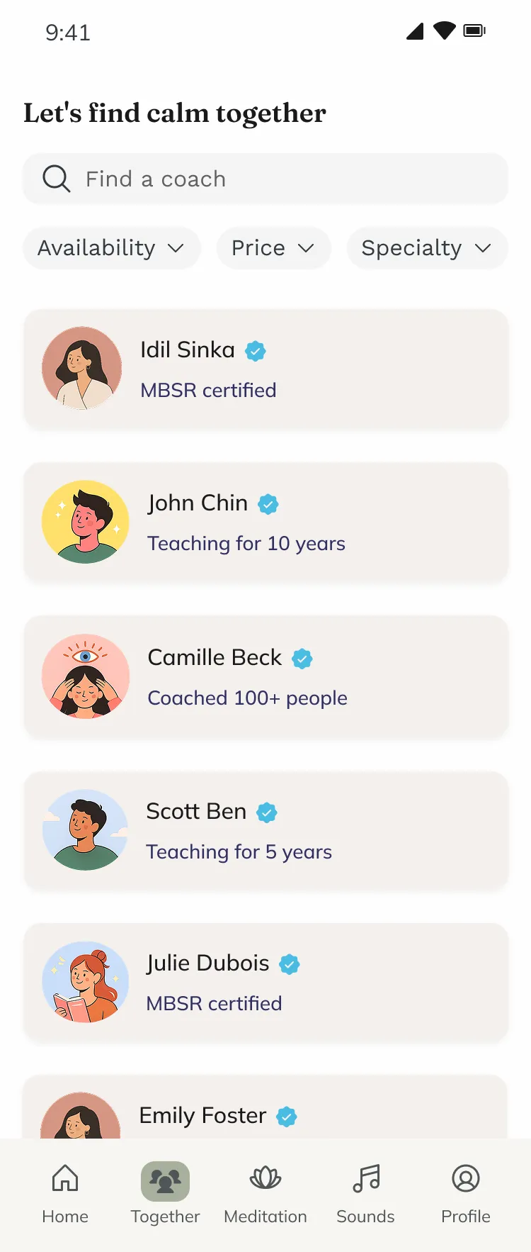
The coach directory provides filters for availability, price and speciality. Profiles bring the person, qualifications, programme and schedule together. The “Together” tab makes accompaniment a destination in its own right.
The walkthrough follows this path from the directory to a coach’s profile, then through their available sessions.
A useful session can end outside the app.
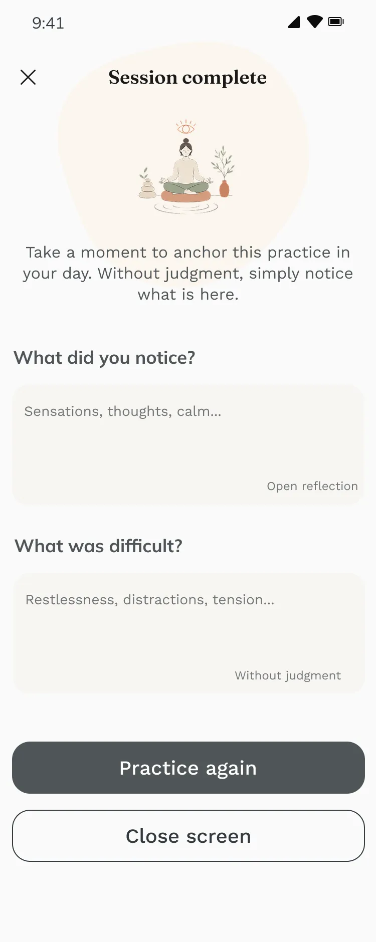
The completion screen asks what the person noticed and what was difficult. The prompts invite a private, qualitative reflection, without awarding a badge or rating the experience.
“Close screen” sits alongside “Practice again”. It makes leaving an explicit option. On return, the home screen offers the next session and a few practices, with no streak to protect.
A key lesson from designing Pauze: success criteria influence what an interface asks of people. Here, the intended value is in the practice they can carry into their day.
A complete argument from research to interface. A concept whose effects still need to be tested.
Pauze translated the research into concrete design choices: human support has a visible place, onboarding acknowledges different rhythms, and completion allows the experience to end. It also sharpened my approach to product design: deciding what to measure is part of deciding what to build.
There are no launch, retention or wellbeing results to report. The sample was limited, and the final concept was not user-tested. Recorded flows demonstrate the intended journey; they do not validate its usability or its effect on practice.
Can a newcomer find appropriate guidance, understand the format and book confidently? Test with people beyond the original research sample.
Make optional onboarding explicit; clarify prices, teacher qualifications and the first try without an account. Check contrast, text sizing and accessible alternatives to audio.
Observe whether people can restart after a break without pressure, and whether the service helps them practise outside the app. Investigate a viable model for human guidance.